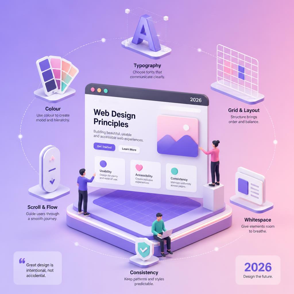
Web design moves fast. Tools change, frameworks come and go, and visual trends cycle in and out of fashion every few years. But beneath the surface, certain principles have stayed relevant for over a decade — not because they’re traditional, but because they reflect how people actually use websites.
This article revisits six foundational ideas in web design and examines what they look like in 2026. Some have evolved dramatically. Others have stayed the same for good reason.
1. Scroll Effects — From Parallax to Scroll-Driven Animation
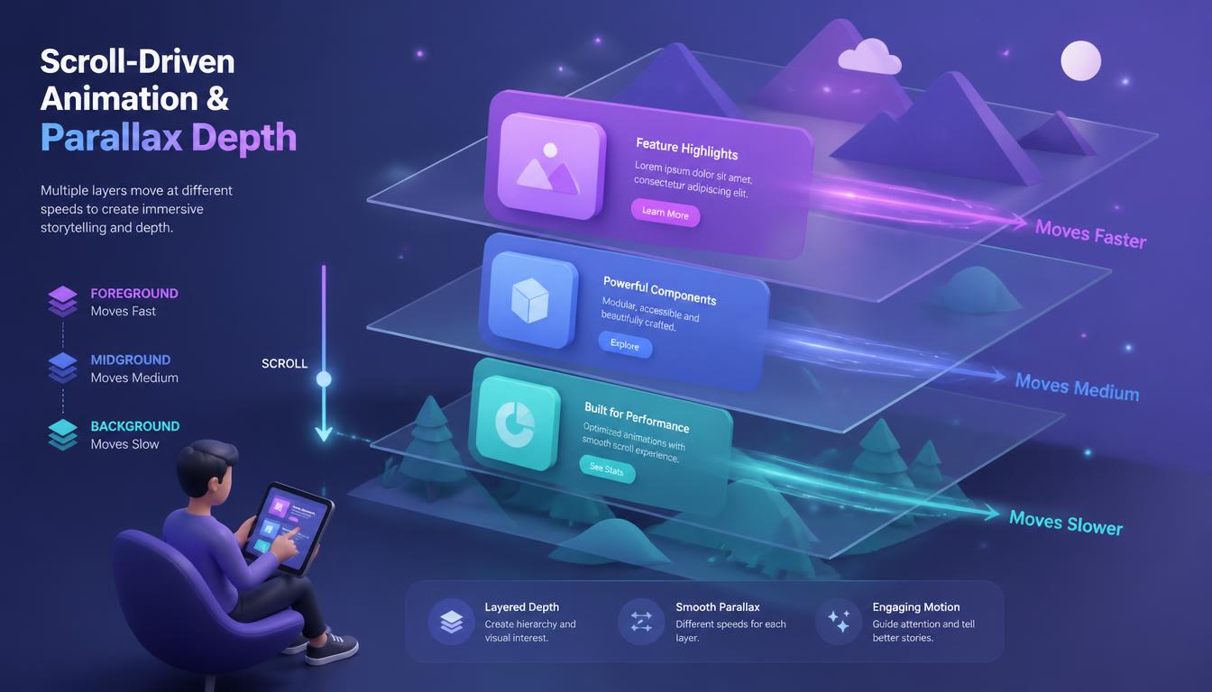
Parallax scrolling was one of the defining web design techniques of the early 2010s. The idea was simple: background elements move more slowly than foreground content during scrolling, creating an illusion of depth. For a while, it felt revolutionary.
Scroll Effects: Parallax Animation
In 2026, parallax in its original form has largely fallen out of favour — not because the concept was flawed, but because it was overused and often implemented poorly. Heavy JavaScript-based parallax libraries added page weight, caused layout shifts, and created accessibility problems for users with vestibular disorders.
What replaced it is far more sophisticated: scroll-driven animations using native CSS.
The CSS Scroll Timeline API, now supported across all major browsers, allows designers to tie animations directly to scroll position without a single line of JavaScript. Elements can fade in, scale up, rotate, or change colour purely through CSS as the user scrolls. This approach is performant, accessible (you can disable it with prefers-reduced-motion), and doesn’t require a third-party library.
For richer interactive storytelling — what’s often called scrollytelling — tools like GSAP (GreenSock), Webflow interactions, and Framer’s scroll-based components give designers fine-grained control. Editorial sites and product landing pages use these techniques to guide users through a narrative as they scroll, rather than just decorating the background.
The principle behind parallax — creating a sense of depth and guiding attention through movement — is more relevant than ever. The implementation has simply caught up with the ambition.
2. Flat Design — Evolved into Layered and Expressive UI
Flat design emerged as a reaction to skeuomorphism — the heavily textured, glossy, shadow-laden design style that dominated mobile interfaces in the early 2010s. It prioritised clarity, whitespace, and bold colour over decoration.
Flat Design: Layered and Expressive UI
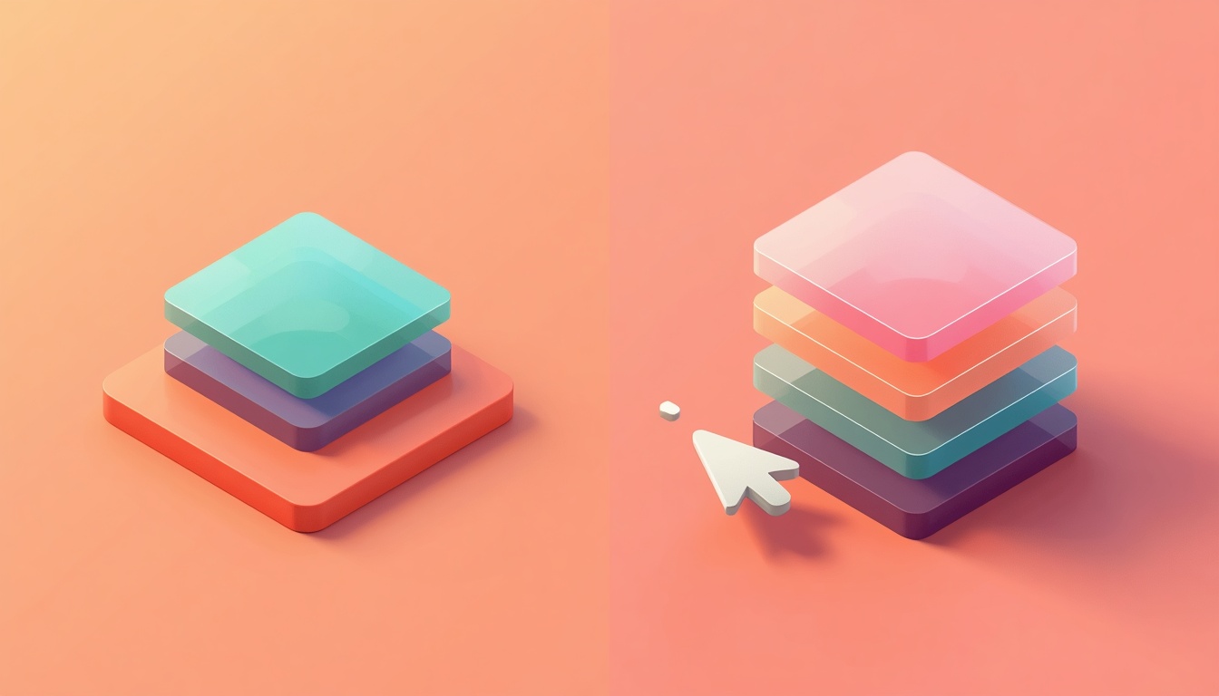
The examples used at the time were Windows 8 and iOS 7. Both were genuinely influential, but flat design in its purest form turned out to have its own problems: without visual depth cues, users sometimes struggled to distinguish interactive elements from decorative ones. Everything looked the same.
What followed was a middle ground. Google’s Material Design introduced the concept of elevation — using shadows and layers to communicate hierarchy and interactivity while keeping interfaces clean. Apple evolved from flat iOS 7 into a more nuanced style that uses translucency, blur, and subtle gradients. Designers now talk about “claymorphism”, “glassmorphism”, and layered card-based layouts — all descendants of flat design, but with spatial awareness added back in.
In 2026, the principle that has survived is this: interfaces should be simple enough to understand instantly, but expressive enough to communicate hierarchy and guide action. The aesthetic vehicles keep changing. The UX goal doesn’t.
3. Single-Page Websites — Now a Strategic Choice, Not a Default
Single-page websites had a long moment in the spotlight, particularly for portfolios, agencies, and product landing pages. Instead of navigating between separate pages, users scroll through all content in a single continuous experience. For mobile users, this felt more natural and reduced friction.

Single-Page Websites: A Strategic Choice
The case for single-page sites was strong in the early days of responsive design, when mobile browsers were slower and page loads were expensive. Keeping everything on one page meant fewer HTTP requests, simpler navigation, and a more app-like feel.
In 2026, the picture is more nuanced. Single-page architecture works well for specific use cases:
- Landing pages with a single conversion goal (sign up, buy, book a call)
- Portfolios with a small amount of curated work
- Event or campaign pages with a defined lifespan
- App marketing pages where the product does the heavy lifting
But for businesses that need to rank in search for multiple topics — a local service company, an ecommerce brand, a content publisher — single-page sites are a significant SEO liability. Each page on a multi-page site can target a distinct keyword, build topical authority, and earn links independently. A single page can only do so much.
The rise of SEO-driven web design has shifted how many agencies and freelancers approach architecture. The best result is usually a site that feels as smooth and immediate as a single-page experience — thanks to instant page transitions and prefetching — while maintaining a proper URL structure underneath. Frameworks like Next.js and Astro make this straightforward.
4. High-Resolution and Adaptive Design — Now Table Stakes
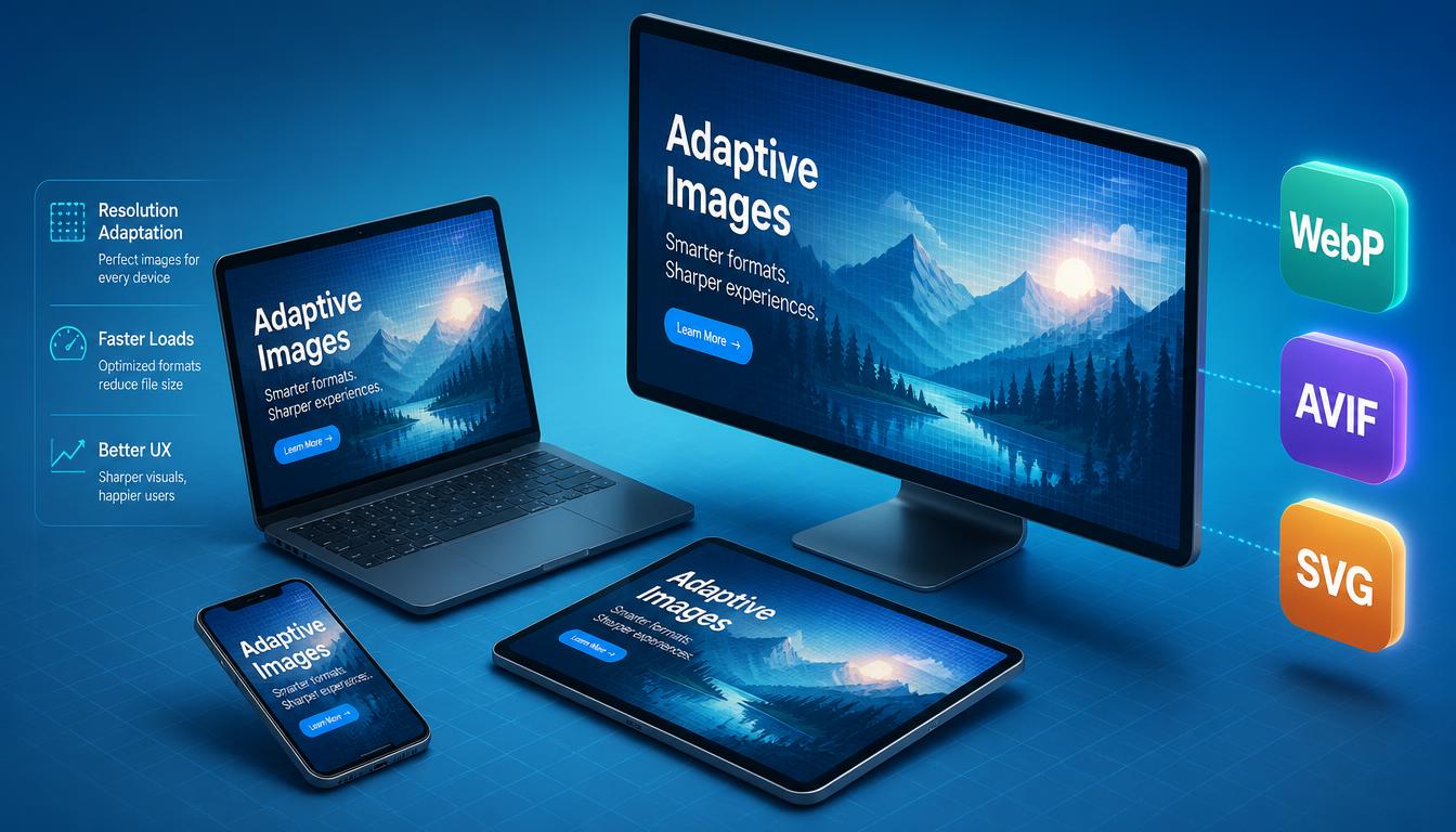
When retina displays first appeared on iPhones in 2010, designers had to rethink their entire approach to images and icons. Bitmap images that looked sharp on standard screens appeared blurry on high-DPI displays. The solution was to serve 2x (and eventually 3x) versions of every image.
High-Resolution and Adaptive Design
In 2026, this is no longer an interesting design challenge — it’s just baseline practice. Every modern display, from smartphones to 4K monitors to foldables, has a pixel density that demands properly optimised assets. The interesting questions have moved on.
What matters now is not just resolution, but format and delivery:
- WebP and AVIF are the standard image formats for web. AVIF in particular offers significantly better compression than JPEG at equivalent quality, which matters for Core Web Vitals scores.
- SVG for icons and illustrations — infinitely scalable, tiny file size, animatable with CSS.
- Responsive images using
srcsetandsizesattributes, so browsers load the appropriately sized image for each viewport and device pixel ratio — not the same giant image for everything. - Lazy loading as a default, so off-screen images don’t block initial page render.
Image optimisation is also directly connected to user experience and search ranking. Google’s Core Web Vitals — specifically Largest Contentful Paint (LCP) — is heavily influenced by how quickly the main image or hero section loads. Poor image delivery is one of the most common reasons sites fail their CWV assessment.
5. Typography — Now Central to Brand Identity
Typography was already gaining importance in the early 2010s as web fonts became more accessible through Google Fonts and Typekit (now Adobe Fonts). But the range of available fonts was still limited, and most websites defaulted to a handful of safe choices.
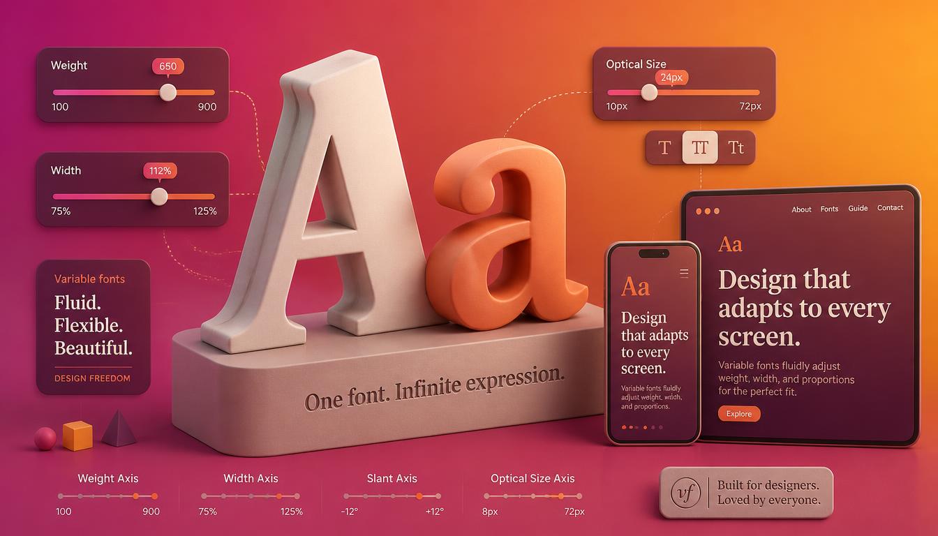
Typography: Brand Identity and Variable Fonts
In 2026, typography in web design has become a primary brand differentiator. Several developments have changed the game entirely:
Variable fonts are now mainstream. A single variable font file can contain an entire range of weights, widths, and optical sizes, controlled through CSS. This means you can have a font that transitions from ultra-light to extra-bold using a single CSS property — with no additional file downloads. Variable fonts are both more expressive and more performant than loading multiple static font files.
Bold, expressive type has become a visual trend in its own right. Where the 2010s favoured minimal, neutral sans-serifs, 2026 sees brands using oversized headlines, unusual display typefaces, and deliberate clashes between type styles to create personality. The font is often the design.
Fluid typography — using CSS clamp() to scale type smoothly between viewport sizes rather than stepping through fixed breakpoints — is now standard practice. Text scales proportionally from mobile to desktop without abrupt jumps.
Typography choices directly affect SEO too. Clear typographic hierarchy (H1, H2, H3 used meaningfully), sufficient line height and contrast for readability, and appropriately sized body text on mobile all contribute to how Google assesses page quality.
6. CMS-Based Websites — WordPress Dominant, But the Landscape Has Widened
The observation that CMS-based websites were growing rapidly was accurate in 2013, and it has only become more true since. The ability for non-technical clients to manage their own content is not a luxury — it’s an expectation.
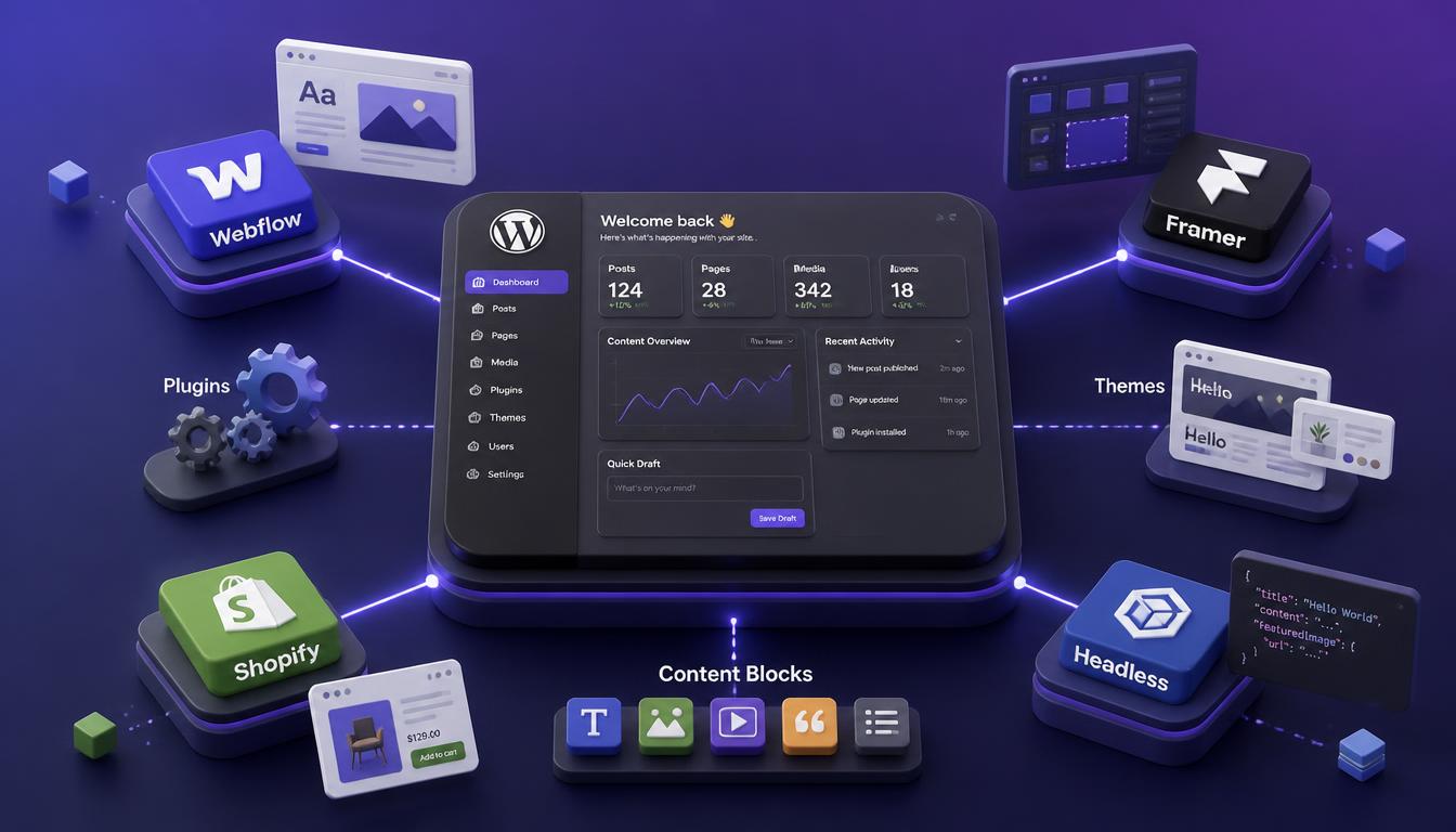
CMS Landscape: WordPress Dominance
WordPress still powers roughly 43% of all websites on the internet as of 2026. Its dominance is partly historical, partly ecosystem-driven (the sheer volume of themes, plugins, and developer knowledge is impossible to replicate quickly), and partly because it genuinely does most things very well when properly configured.
WordPress development in 2026 looks quite different from a decade ago, though. Page builders like Elementor and the Bricks Builder have moved most site-building work into visual editors. The Full Site Editing (FSE) experience built on Gutenberg is maturing. Plugins like Rank Math for SEO, WP Rocket for performance, and WooCommerce for ecommerce have become standard parts of a professional WordPress build.
Beyond WordPress, several platforms have gained serious traction:
- Webflow — a visual-first platform that generates clean code. Popular with designers who want full creative control without writing CSS from scratch. Includes a built-in CMS.
- Framer — increasingly popular for landing pages and portfolios, with excellent animation capabilities and a fast CMS layer.
- Shopify — the dominant platform for ecommerce, with a rich app ecosystem and strong performance out of the box.
- Headless CMS setups — using a CMS like Contentful, Sanity, or WordPress as a headless backend, paired with a frontend framework like Next.js or Astro. This approach gives developers maximum flexibility and performance, at the cost of higher complexity and maintenance overhead.
Choosing the right CMS for a project is now a significant strategic decision, not a default. The answer depends on the client’s technical comfort level, the complexity of the content model, performance requirements, and long-term maintenance expectations. For most small to mid-size businesses, WordPress remains the right answer. For larger or more specialised projects, the landscape has never been richer.
What These Principles Have in Common
Looking at these six areas — scroll effects, visual simplicity, site architecture, image delivery, typography, and CMS — a pattern emerges. The underlying goals haven’t changed much since 2013: help users find what they need, quickly, on any device, in a way that feels effortless.
Common Pattern: Converging Design Principles
What has changed is the sophistication of the tools available to achieve those goals, and the complexity of the environment websites operate in. A site in 2026 needs to perform well on a 5G smartphone and a slow broadband connection. It needs to rank in Google search and in AI Overviews. It needs to meet accessibility standards that are now, in many jurisdictions, legally required. It needs to load in under two seconds or risk losing the visitor entirely.
Good web design has always been about solving real problems for real people. That hasn’t changed. Everything else is implementation detail.
Ready to Apply These Principles to Your Website?
Whether you’re planning a new build or wondering if your current site is keeping up, these fundamentals are a good starting point for an honest audit.
Apply These Principles Today
If you’d like a second opinion on your site’s design, performance, or structure, get in touch — I work with businesses across the UK on web design and development projects that are built to perform, not just to look good.
You might also find these useful:
- Website User Experience — What Actually Matters
- Responsive Design Tutorials
- Typography in Web Design
- Web Design Trends

With over two decades of web design and development expertise, I craft bespoke WordPress solutions at FallingBrick, delivering visually striking, high-performing websites optimised for user experience and SEO.