Every year brings new trends in web design. Below you can find the latest six (the most important) rules with examples.
Rule no.1 – The most important now – Responsive Web Design (RWD)
One design fits the multi-screen sizes – desktop, tablet, and mobile devices.
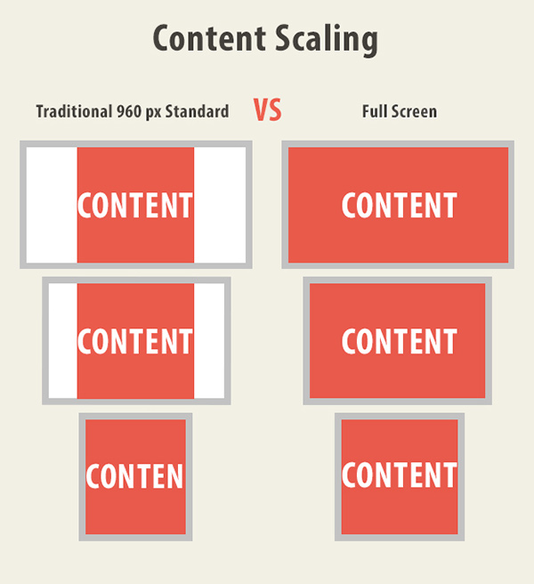
The Boston Globe is a perfect example of how the news site can fit any screen size.

Rule no.2 – Swiss design style as a main web design trend
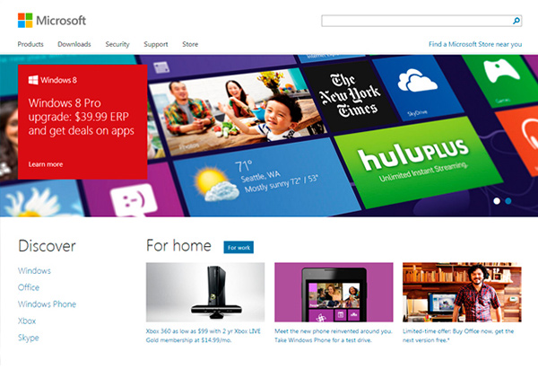
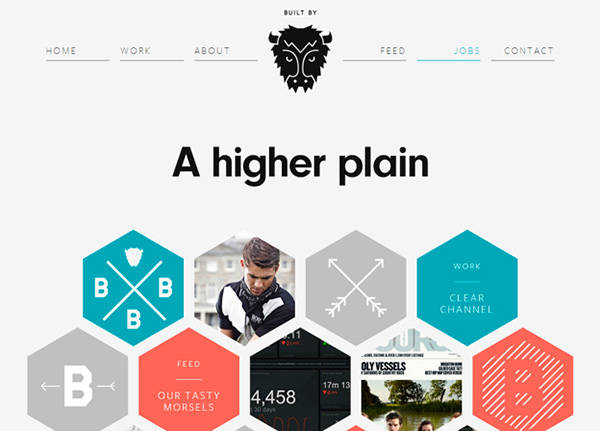
Simplicity based on the grids, typography, sans-serif typefaces and asymmetrical layouts.
Examples:
Rule no.3 – Website Designs with storytelling experience
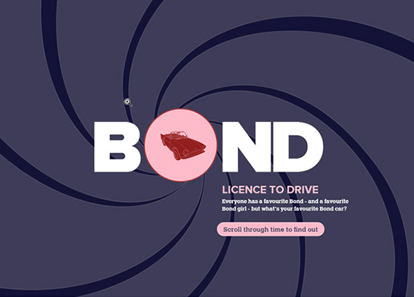
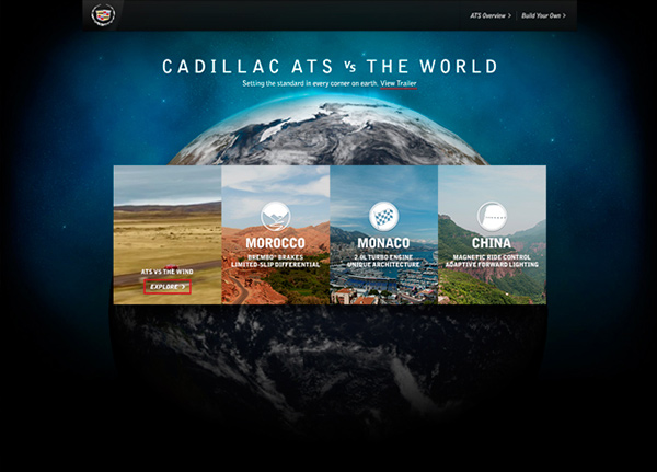
Big images cover the whole browser window.
Here is a great example – Cadillac’s ATS vs. The World
Rule no.4 – HTML5 & JavaScript replace Flash technology
Mainly because Apple doesn’t support Flash technology (imagine how many people use Apple products now). Flash wasn’t really good for SEO (Search Engine Optimisation) either.
Flash was replaced with HTML5, CSS3, Javascript, Canvas, etc.
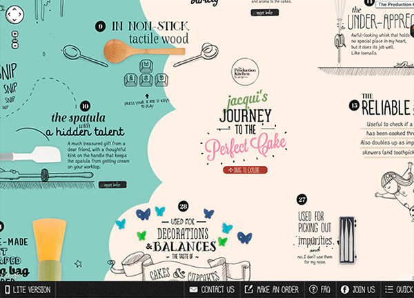
New styles and ideas for the site navigation.
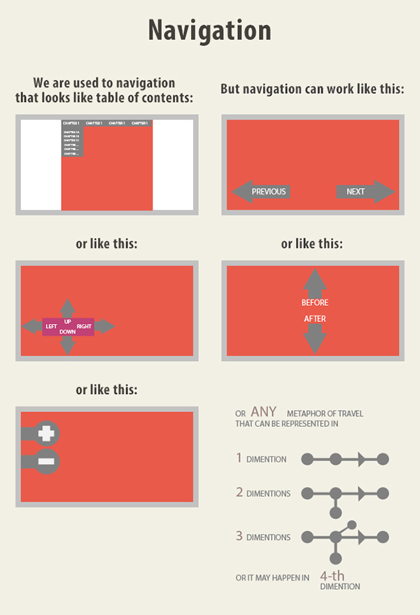
Examples:
Rule no.6 – Website designs with parallax effect
The parallax effect gives you an illusion of depth by making layers of a page move at different speeds as viewers scroll.
Examples:
Zuelements


With over two decades of web design and development expertise, I craft bespoke WordPress solutions at FallingBrick, delivering visually striking, high-performing websites optimised for user experience and SEO.


