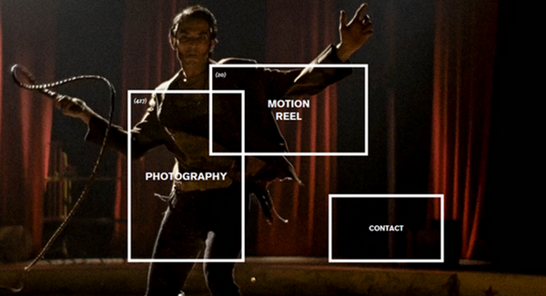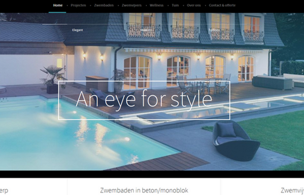
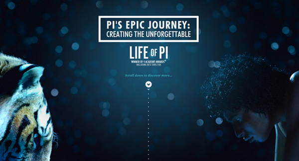
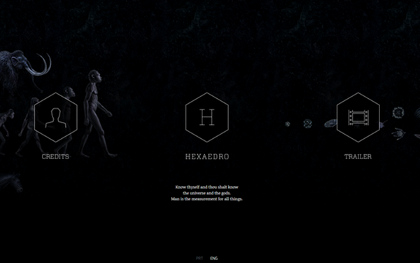
Transparent outline boxes in website design are getting more popular nowadays. To achieve a nice-looking layout they should be used in the high contrast between the background and foreground elements.
If you’ll use them in the right place they will give your design its special appeal and will impress the visitors – guaranteed!
Watch out for one thing – if the lines will be too thin – you’ll lose the effect because they will merge into the design.
In my opinion, they look the best on full-image backgrounds.
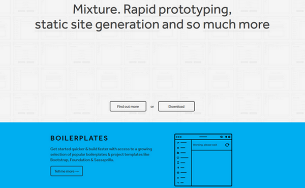
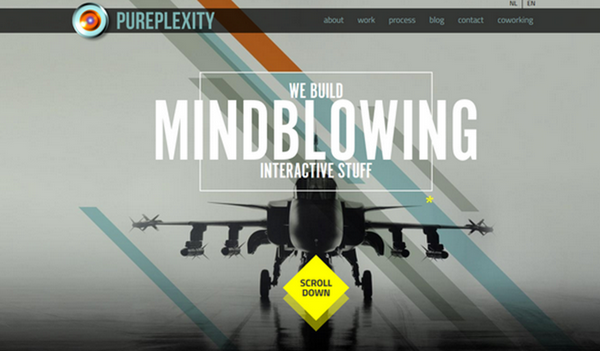
Below you can see some examples of outline elements in website design.
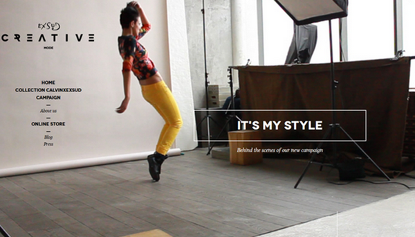
Exsud Creative
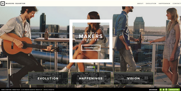
Makers Quarter
Life of Pi
Hexaedro
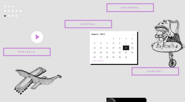
Ola Kvernberg
Mixture
polecat
Perplexity
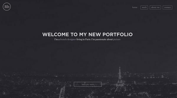
Romain Briaux
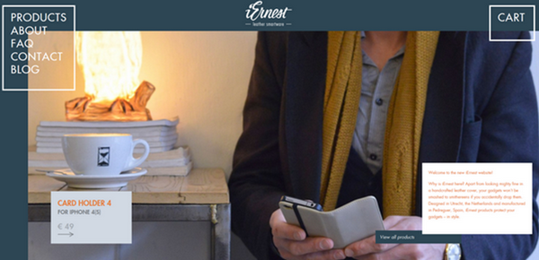
Ernest
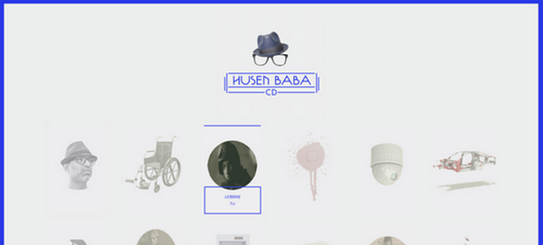
Husenbaba
BeFIT

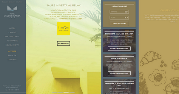
Hotel Lago di Garda
Olivier Staub
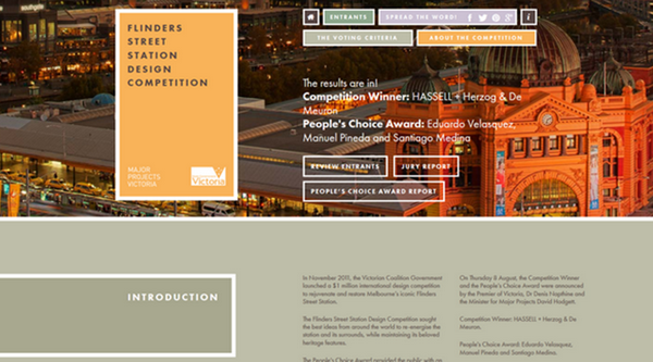
Flinders Street Station Design Competition
Quechua

LCDV
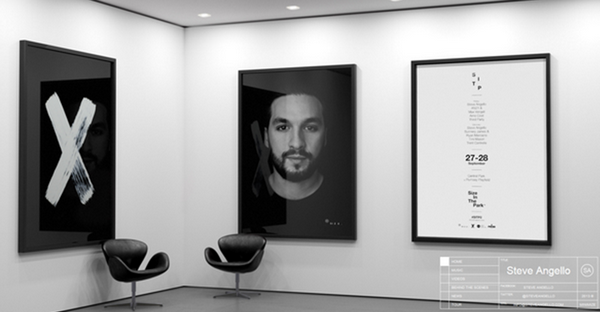
Steve Angello’s welcome section
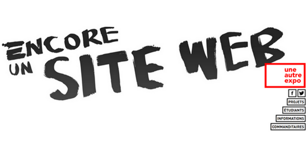
Un autre expo
Resume
The outline boxes are valuable elements to use if we would like to add some soft but prominent accents to our website design.

With over two decades of web design and development expertise, I craft bespoke WordPress solutions at FallingBrick, delivering visually striking, high-performing websites optimised for user experience and SEO.


