
Every December, the Pantone Colour Institute reveals its Colour of the Year — a shade intended to reflect the mood, direction and cultural atmosphere of the year ahead. For 2026, Pantone has selected PANTONE 11-4201 Cloud Dancer, a soft and understated white designed to bring a sense of calm, clarity and openness to an increasingly overstimulated world.
Rather than choosing a bold or highly expressive colour, Pantone’s latest selection moves in a quieter direction. Cloud Dancer feels clean, spacious and restrained — a colour that creates breathing room instead of competing for attention.
In many ways, the choice reflects the broader shift happening across design, technology and modern lifestyles. As digital fatigue continues to grow, minimalism and softer visual experiences are becoming increasingly desirable.
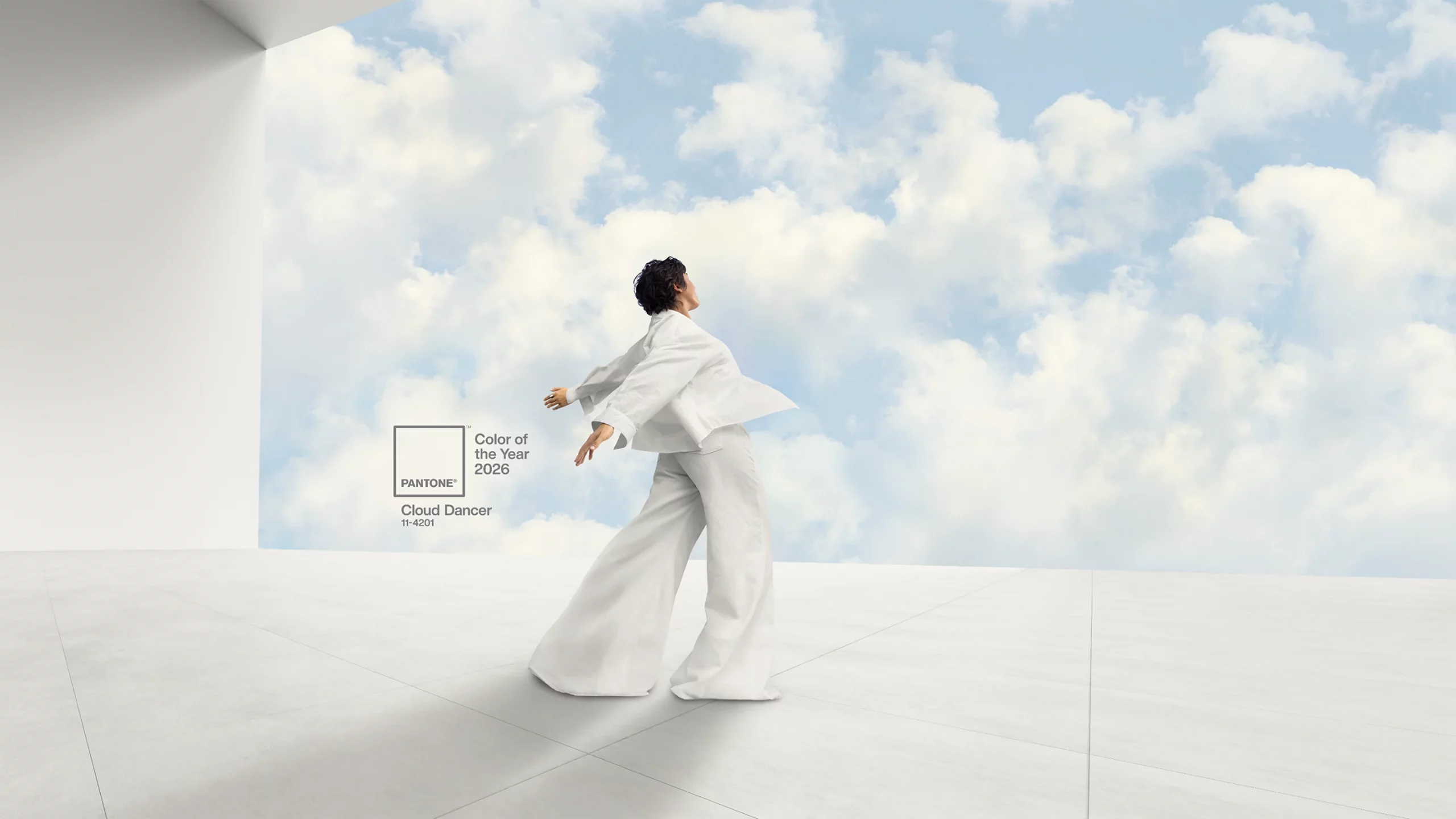
Pantone Colour of the Year
What exactly is Cloud Dancer?
Pantone describes Cloud Dancer as “a billowy white imbued with serenity”, and the description feels fitting. Unlike harsh clinical whites often associated with minimal design, Cloud Dancer carries warmth and softness. It resembles filtered daylight, drifting cloud cover or the subtle glow of natural light rather than a stark painted surface.
According to Pantone, the colour encourages focus, stillness and creativity by reducing visual noise and allowing space for reflection. It is intended to create environments that feel lighter, calmer and less overwhelming.
Where previous Colour of the Year selections often aimed to energise or provoke, Cloud Dancer takes a far more understated approach.
The meaning behind Pantone’s 2026 choice
According to Laurie Pressman, Vice President of the Pantone Colour Institute:
Similar to a blank canvas, Cloud Dancer signifies our desire for a fresh start. Peeling away layers of outmoded thinking, we open the door to new approaches. An airy white hue, PANTONE 11-4201 Cloud Dancer opens up space for creativity, allowing our imagination to drift so that new insights and bold ideas can emerge and take shape.
Pantone’s Executive Director, Leatrice Eiseman, also connected the colour to the overwhelming pace of modern life:
At this time of transformation, when we are reimagining our future and our place in the world, PANTONE 11-4201 Cloud Dancer is a discrete white hue offering a promise of clarity. The cacophony that surrounds us has become overwhelming, making it harder to hear the voices of our inner selves. A conscious statement of simplification, Cloud Dancer enhances our focus, providing release from the distraction of external influences.
The reasoning feels particularly relevant in 2026. Between constant notifications, AI-generated content, fast-moving social feeds and an endless stream of online information, many people are actively seeking quieter and more intentional digital experiences.
Cloud Dancer reflects that shift perfectly.
How Cloud Dancer compares to previous Pantone colours
Recent Pantone selections often leaned towards more expressive and emotionally charged tones. Shades such as Viva Magenta and Peach Fuzz focused on individuality, warmth and self-expression. Cloud Dancer moves in a noticeably different direction.
Instead of demanding attention, it deliberately steps back. That subtlety feels far more aligned with current design trends, where calm interfaces, muted palettes and minimalist aesthetics continue to gain popularity.
The growing preference for softer visuals is especially noticeable online. Many brands are simplifying their websites, reducing clutter and moving towards more spacious layouts that feel easier to navigate and less visually exhausting.
Using Cloud Dancer in modern design
Because of its versatility and softness, Cloud Dancer works well across both digital and physical environments. Rather than dominating a design, it creates balance and allows surrounding elements to stand out more naturally.
- Web design: Cloud Dancer works exceptionally well as a background colour for minimalist websites, editorial layouts and premium brands. It softens contrast, improves readability and reduces visual fatigue during long browsing sessions.
- Interior design: In physical spaces, the shade creates bright and open environments without feeling cold or sterile. It works particularly well in home offices, studios, wellness spaces and contemporary interiors.
- Brand identity: Brands focused on sustainability, wellness, simplicity or modern luxury can use Cloud Dancer to communicate clarity, honesty and sophistication.
- Packaging design: The colour also fits naturally into modern packaging trends, especially for skincare, lifestyle and eco-conscious products where subtlety and minimalism often feel more premium than loud branding.
Cloud Dancer and modern digital aesthetics
The rise of dark mode, OLED displays and AI-generated visuals has changed the way designers approach colour. In 2026, white is no longer treated as a simple neutral background — it has become part of the overall user experience.
Soft whites like Cloud Dancer feel less aggressive than pure white layouts while still maintaining brightness and clarity. They work especially well in modern UI systems, editorial websites and minimalist mobile apps where readability and visual comfort matter.
Combined with muted typography, soft shadows and spacious layouts, Cloud Dancer helps create digital experiences that feel calmer and more refined.
Its flexibility also makes it easy to pair with trending accent colours, including muted blues, earthy neutrals, warm metallics and darker charcoal tones.
Why a white tone makes sense in 2026
At first glance, selecting a soft white as Colour of the Year may seem understated compared to previous choices. But that restraint is likely the entire point.
Modern life has become visually overwhelming. Brands, apps and platforms constantly compete for attention using louder colours, stronger contrast and increasingly crowded interfaces. Against that backdrop, simplicity itself begins to feel refreshing.
Cloud Dancer is not designed to dominate attention — it is designed to create space.
Rather than acting as an escape from reality, the colour functions more like a reset. It allows surrounding elements to breathe while helping users and audiences focus more naturally on content, products and ideas.
In many ways, Pantone’s 2026 selection says less about colour trends themselves and more about what people are currently craving: clarity, balance and a break from constant visual noise.
A quieter direction for future design trends
Pantone’s choice for 2026 may not be the boldest Colour of the Year announcement in recent memory, but it could easily become one of the most influential.
As digital culture matures, designers are increasingly recognising that effective design does not always need to shout. Sometimes the strongest visual statement comes from restraint, simplicity and thoughtful use of space.
Cloud Dancer captures that mindset perfectly — soft, adaptable and intentionally calm in a world that rarely slows down.

With over two decades of web design and development expertise, I craft bespoke WordPress solutions at FallingBrick, delivering visually striking, high-performing websites optimised for user experience and SEO.