
Website design inspiration is most useful when it helps you recognise patterns rather than copy appearances. A homepage may look striking in isolation, but it only becomes relevant if its structure suits your message, audience and goals.
Good inspiration asks why a design works: how it directs attention, reduces friction, builds trust or makes the next step obvious. The 25 ideas below cover layout, typography, colour, imagery, navigation, accessibility, speed and conversion. Where a topic deserves more depth, the article links to dedicated guides on this site.
1. Start with a strong first impression
Visitors form judgements quickly. The first screen should answer three questions: what you offer, who it is for and why it matters. Avoid vague headlines, decorative text that hides the message and heroes that force users to scroll before they understand the page.
Use a clear statement, a short supporting line and one primary action. If someone cannot tell what to do next within a few seconds, the design needs tightening. For a broader starting point, review how to choose a website design that fits your business.
2. Use visual hierarchy
Visual hierarchy guides the eye through a page. Size, weight, colour, spacing and position all signal importance. A well-structured page tells users what to read first, what to consider next and which action matters most.
Keep the hierarchy disciplined. One dominant message is usually enough for the opening view. Supporting details can follow in smaller, calmer typography. When every element competes for attention, the page feels noisy and the main point disappears. The underlying rules are covered in our guide to web design principles.

Visual hierarchy guides the eye from the hero section down the page
A good menu answers one question: how do I get where I need to go? Limit top-level items, name them in plain language and avoid dropdown traps. If people keep reaching for the search box instead of the menu, the structure is probably asking too much.
Good navigation is part of a wider website user experience strategy.
4. Use white space properly
White space is not wasted space. It gives content room to breathe, separates groups of information and makes pages easier to scan. Crowded layouts increase cognitive load, particularly on mobile.
Generous margins, line spacing and section breaks can make a site feel more premium without adding anything new. This is one reason minimalist web design remains effective: it removes noise and lets the important elements speak.
5. Choose typography carefully
Type does more than look nice; it controls pace, emphasis and comprehension. Use a limited set of fonts and make sure body text is comfortable at small sizes. Check line length, line height and heading contrast.
A beautiful display font may suit a brand, but it should never compromise comprehension. For most sites, clarity beats novelty. Our guide to typography in web design explains how to balance personality with legibility.
6. Use colour with purpose
Treat colour as a communication tool, not decoration. It can signal brand identity, separate sections, highlight actions and create contrast. Keep palettes disciplined: too many colours can make a site look inconsistent and difficult to trust.
Always check text against backgrounds, especially for buttons, forms and navigation. If you are refining your palette, start with our article on colour theory in web design.
Typography, colour and white space working together on a designer canvas
7. Create a strong hero section
The hero area sets expectations. It should combine a concise headline, a short supporting paragraph and a visible call to action. Avoid full-screen sliders unless they genuinely add value; they often slow users down and push important content below the fold.
A calm, focused hero usually performs better than a busy one. For more practical guidance, see our website design tips.
8. Use high-quality images
Images shape perception quickly. Weak stock photography, stretched graphics and unclear visuals can undermine credibility. Choose images that reflect your actual product, service, team or environment.
Compress them appropriately and provide descriptive alt text. Good imagery should support the message, not distract from it. Because large media files can also affect performance, review our guide to website speed.
9. Make calls to action clear
Every key page should have a next step. Use action-led wording such as “Request a quote”, “Book a consultation” or “View our portfolio” rather than vague labels like “Submit” or “Learn more” when a stronger option exists.
Make the primary call to action visually distinct and place secondary actions lower in the hierarchy. A clear CTA is not aggressive; it simply removes doubt about what happens next.
10. Design for mobile first
Mobile-first is not just responsive resizing. It forces you to prioritise content, simplify layouts and make touch targets usable. On a phone, a small button is a missed tap; a long form is an abandoned enquiry; buried navigation is a lost visitor.
Start with the smallest screen, then enhance for larger ones. Our article on mobile-first design explains why this approach usually produces cleaner, faster websites.
11. Keep content easy to scan
Most visitors skim before they commit. Short paragraphs, descriptive subheadings, bullet points and highlighted summaries help users find value quickly. Avoid long blocks of text unless the topic demands depth.
If a page looks dense, break it up. Give each section a heading that says what the reader will get, not just a label. Scannable content is more likely to be read, understood and acted upon.
12. Use grids without making the design generic
Grids create order, but rigid templates can make a site feel interchangeable. Use a consistent base layout, then introduce variation through image scale, section rhythm and asymmetric elements.
For example, repeat the same container width but let one image break the column, or allow a testimonial to occupy a wider band. The goal is structure with personality: a grid should make content easier to follow, not flatten every page into the same pattern.
13. Add subtle animation
Animation can help users understand sequence: what appeared, what changed and where attention should go. Use short fades, directional slides or progressive reveals to connect sections without delaying access to content.
Motion should never become an obstacle. If a user has asked for reduced motion, respect that preference immediately and provide a calm alternative.
14. Use microinteractions
Microinteractions are the small responses that confirm the site is working. A field that validates input, a button that visibly reacts, a loading indicator that explains a wait: these details answer the user’s silent question, “Did that work?”
They are easy to overlook, but they build confidence and reduce uncertainty. For practical examples, read our guide to microinteractions in web design.
15. Make forms easier to use
Forms are where many projects lose momentum. Ask only for information you genuinely need. Use clear labels, logical grouping, helpful error messages and visible progress for multi-step processes.
Auto-fill, sensible defaults and inline validation can reduce friction significantly. A shorter form usually converts better than a clever one. If a field does not serve a clear purpose, remove it.

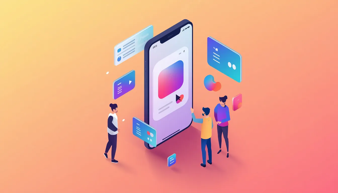
Mobile-first layout with simple forms and clear touch targets
16. Build trust into the design
Trust is visual as well as verbal. Consistent branding, readable contact details, realistic imagery, client logos, testimonials and clear policies all help. Avoid outdated design cues, broken layouts or aggressive pop-ups that make a business seem careless.
A hidden phone number, a generic email and a stale copyright year can do more damage than a modest layout.
17. Keep branding consistent
Your website is not a separate entity from the brand; it is one of its loudest expressions. Colours, typography, tone of voice, icon styles and photography direction should align across pages.
Inconsistency creates doubt. If your brand is calm and professional, the design should not suddenly become noisy and chaotic on the pricing page. Cohesion helps users recognise where they are and reinforces credibility.
18. Design for accessibility
Accessible design is better design. It includes sufficient colour contrast, keyboard navigation, semantic headings, alt text, readable fonts and clear focus states.
Accessibility is not only an ethical requirement; it expands your audience and often improves usability for everyone. Check your site with assistive tools, not just pretty mock-ups. Simple fixes such as proper heading order and visible focus outlines can make a substantial difference.
19. Do not sacrifice speed for appearance
A slow website damages first impressions. Large images, unnecessary scripts, web fonts and heavy animations can all reduce performance. Optimise assets, lazy-load non-critical media and choose templates that do not force excessive code.
Speed is part of design. Users rarely admire a beautiful page that takes too long to appear. Treat performance as a core design constraint from the beginning, not a technical afterthought.
20. Design around the user’s goal
Before choosing layout or effects, define what the visitor needs to accomplish. Are they comparing services, checking prices, reading case studies or contacting you? Every component should move them closer to that outcome.
If the goal is a quote request, each section should either provide reassurance or remove friction. Map the journey from arrival to action, then delete steps that do not help.
21. Use contrast effectively
Contrast is not only about black text on white backgrounds. It includes size, weight, colour, spacing and position. Strong contrast helps users identify priority and navigate quickly.
Weak contrast causes strain, especially on mobile or in bright environments. Check buttons, links, form labels and navigation items under real conditions: small screens, glare and dimmed settings. Clear distinction is not a detail; it is usability.
22. Create distinctive sections
Long-scrolling pages need rhythm. Alternate background tones, change layout density and use visual dividers to mark new topics. This helps users understand where one subject ends and another begins.
Use contrast in layout to create pace, but keep typography and spacing consistent enough to maintain trust.
23. Think about the full user journey
Inspiration should not stop at the homepage. Consider landing pages, service pages, portfolio entries, blog posts, contact forms and confirmation screens. Each step should reduce uncertainty and maintain momentum.
A beautiful entry page means little if the next click leads to confusion, dead ends or a slow checkout. Design the whole route, not just the front door.
24. Make the design support SEO
Design and SEO overlap more than many teams admit. Clear headings, logical internal links, crawlable navigation, descriptive image alt text and fast loading all help search engines understand and rank pages.
Avoid hiding essential content behind tabs, carousels or JavaScript that may not render reliably. Good structure benefits users and machines alike. When the page is easy to scan, it is often easier to index as well.

Speed, accessibility and SEO as part of the design process
25. Keep the design simple
Simplicity is difficult because it requires decisions about what to remove. Every element should earn its place. If a banner, widget, pop-up or decorative effect does not support the user’s goal, question it.
Clean layouts, focused messaging and restrained visuals often create a stronger impression than overloaded pages. The best website design inspiration is not always about adding something new; sometimes it is about taking away what does not matter.
How to use this list
You do not need to apply all 25 ideas at once. Start with the three or four that address your biggest weakness — usually clarity, trust or speed. Review one page at a time. Make the change. Measure the effect. Then move to the next area. If you are planning to build the site yourself, our guide to free website design software explains what those tools can and cannot do.
Begin with the homepage or a key landing page. Compare it against the list and note only the issues that block understanding or action. Fix those first. After a few weeks, check whether enquiries, scroll depth or conversion have improved. Only then move to another page.
The most useful website design inspiration does not come from copying another company’s homepage. It comes from understanding the decisions behind that design: how it communicates value, reduces friction, builds trust and guides the user towards a clear next step.
Use these 25 ideas as a checklist for your own project. Review your layout, typography, colour, navigation, imagery, speed and user journey. Then test the changes with real users whenever possible.
Good design is not just about looking impressive. It is about making the right thing feel obvious.
Frequently asked questions
What is website design inspiration?
Website design inspiration is the practice of studying effective design patterns — such as layout, typography, colour, navigation and user journeys — and adapting them to your own brand, content and audience. It is more useful when it focuses on why a design works, not simply on how it looks.
Should I copy other websites for design inspiration?
No. Copying another website can create confusion, weaken your brand and ignore the specific needs of your users. Use other sites to understand which patterns solve problems, then apply those principles in a way that fits your business.
What makes a website design good?
A good website design is clear, usable, visually coherent, accessible, fast and aligned with the user’s goal. It should help visitors understand the offer quickly and guide them towards a meaningful action without unnecessary friction.
How often should I update my website design?
There is no fixed schedule. Review your design when analytics, user feedback or conversion data show problems, or when major changes to your brand, services or technology require it. Small, evidence-based improvements are usually better than frequent full redesigns.

With over two decades of web design and development expertise, I craft bespoke WordPress solutions at FallingBrick, delivering visually striking, high-performing websites optimised for user experience and SEO.