Colour is a fundamental aspect of web design that can influence how users perceive and interact with a website. It can evoke emotions, convey information, and set the tone of a website. Thus, understanding colour theory and how to use it effectively is crucial for web designers. This article will cover the basics of colour theory and provide practical tips on how to use colour in web design.
How to Use Colour Theory in Web Design
Colour is one of the most important design elements in web design. It can enhance the aesthetics of a website, create a visual hierarchy, and improve usability. However, using colour in web design is not just about making things look pretty. It also involves understanding the principles of colour theory, colour psychology, and accessibility. In this article, we will explore the basics of colour theory and how to use it effectively in web design.

How to Use Colour Theory in Web Design
What is Colour Theory?
Colour theory is the study of how colours interact with each other and how they can be combined to create pleasing visual compositions. It involves understanding the properties of colour such as hue, saturation, and brightness, as well as the relationships between colours. The colour theory provides a framework for creating colour palettes that are aesthetically pleasing and communicate the desired message.
The Colour Wheel
The colour wheel is a visual representation of the relationships between colours. It consists of primary, secondary, and tertiary colours arranged in a circular format. The primary colours are red, yellow, and blue, and they cannot be created by mixing other colours. The secondary colours are green, orange, and purple, and they are created by mixing two primary colours. The tertiary colours are created by mixing a primary and a secondary colour.

The Colour Wheel
Colour Schemes
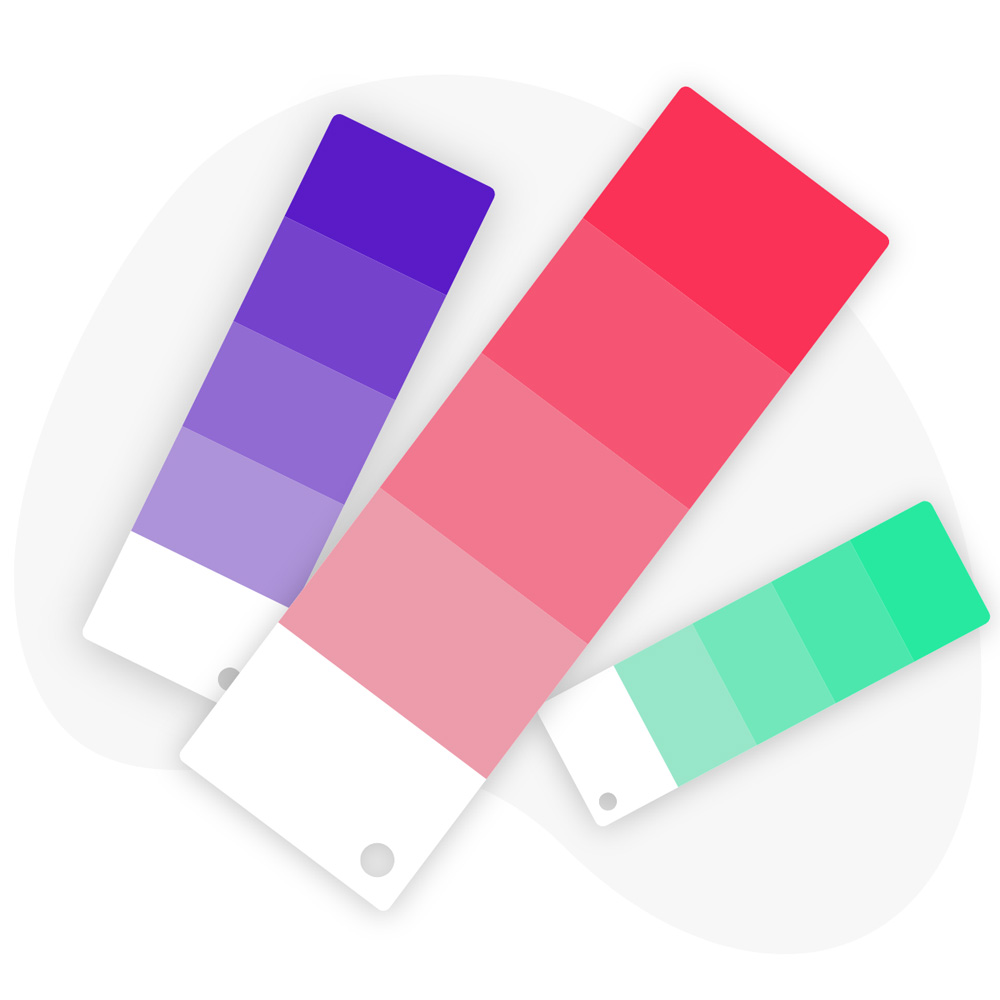
Colour schemes are combinations of colours that are used in the design. There are several types of colour schemes, including monochromatic, analogous, complementary, triadic, and tetradic.
Monochromatic Colour Scheme
A monochromatic colour scheme uses variations of a single colour. This creates a harmonious and cohesive look.
Analogous Colour Scheme
An analogous colour scheme uses colours that are adjacent to each other on the colour wheel. This creates a colour palette that is visually pleasing and easy on the eyes.
Complementary Colour Scheme
A complementary colour scheme uses colours that are opposite to each other on the colour wheel. This creates a high-contrast look that is visually striking.
Triadic Colour Scheme
A triadic colour scheme uses three colours that are equally spaced on the colour wheel. This creates a balanced and vibrant look.
Tetradic Colour Scheme
A tetradic colour scheme uses four colours that are evenly spaced on the colour wheel. This creates a complex and dynamic look.

Colour Schemes
Colour Psychology
Colour psychology is the study of how colours affect human emotions and behaviours. Different colours can evoke different emotions and convey different messages. For example, red is often associated with passion, excitement, and danger, while blue is associated with calmness, trust, and reliability. Understanding colour psychology can help web designers create websites that communicate the desired message and elicit the desired emotions from users.
Contrast and Accessibility
Contrast is an important aspect of web design, especially for users with visual impairments. High contrast between text and background makes it easier for users to read and navigate a website. Additionally, web designers should consider accessibility guidelines such as WCAG (Web Content Accessibility Guidelines) when choosing colour combinations. WCAG provides guidelines for minimum contrast ratios between text and background colours to ensure that users with visual impairments can access and interact with the website.

Contrast and Accessibility
Using Colour in Web Design
There are several ways to use colour in web design to enhance the aesthetics and functionality of a website.
Branding and Identity
Colour is often used to create a distinct brand identity. A well-designed colour palette can communicate the brand’s values, personality, and mission. For example, the colour blue is often used by tech companies to convey trust and reliability, while the colour green is associated with eco-friendliness and sustainability.
Colour can also be used to create a visual hierarchy on a website. Using different colours for different sections or categories of a website can make it easier for users to navigate and find what they are looking for. For example, using a brighter colour for the primary navigation menu and a less saturated colour for the secondary menu can create a clear visual hierarchy.
Calls to Action
Colour can also be used to draw attention to calls to action (CTAs) such as buttons and links. Using a high-contrast colour for CTAs can make them more noticeable and increase the chances of users clicking on them.
Background and Text
Choosing the right colours for the background and text can improve readability and user experience. High contrast between text and background colours is crucial for readability, especially for users with visual impairments. Additionally, using light or dark colors for the background depending on the content can create a pleasant and easy-to-read experience.
Images and Multimedia
Colour can also be used to enhance images and multimedia on a website. Choosing the right colour scheme for images and videos can create a cohesive and visually pleasing experience for users.

Using Colour in Web Design
Best Practices for Using Colour in Web Design
To use colour effectively in web design, web designers should follow some best practices.
Limit the Number of Colours
Using too many colours can create a chaotic and overwhelming experience for users. It is recommended to use a maximum of three to five colours in a colour palette to create a cohesive and harmonious look.
Use High-Contrast Combinations
High contrast between text and background colours is crucial for readability, especially for users with visual impairments. Web designers should choose colour combinations that have a sufficient contrast ratio according to accessibility guidelines.
Consider Accessibility Guidelines
Web designers should follow accessibility guidelines such as WCAG to ensure that users with visual impairments can access and interact with the website.
Test Colours on Different Devices and Environments
Colours can look different on different devices and in different environments. Web designers should test colour combinations on different devices and in different lighting conditions to ensure that they look good and are accessible in all situations.

Best Practices for Using Colour in Web Design
Conclusion
Using colour effectively in web design can enhance the aesthetics and functionality of a website. Understanding colour theory, colour psychology, and accessibility guidelines can help web designers create websites that communicate the desired message and elicit the desired emotions from users. By following best practices and testing colour combinations, web designers can create visually pleasing and accessible websites.
FAQs
What is a colour theory for web designers?
Colour theory is a set of principles that guide the use of colour in various fields, including web design. It involves understanding the different hues, shades, and tones of colours, as well as their relationships and effects on each other.
How do you use colour in web design?
Colour is an essential element of web design that can affect the user’s perception of a website’s brand, message, and functionality. You can use colour in web design to establish hierarchy, create visual interest, evoke emotions, and enhance the user experience.
How do you apply colour theory?
To apply colour theory in web design, you must consider various factors, such as the website’s purpose, target audience, brand identity, and colour psychology. You can use different colour schemes, such as monochromatic, complementary, analogous, triadic, and tetradic, to create visual harmony and balance.
What is the 60-30-10 rule in web design?
The 60-30-10 rule is a popular principle used in web design to create a balanced colour palette. According to this rule, 60% of the colour should be the dominant colour, 30% should be the secondary colour, and 10% should be the accent colour.
How to use colour theory in web design with examples?
You can use colour theory in web design to create various effects, such as contrasting, highlighting, and blending. For example, you can use contrasting colours to make certain elements stand out, such as call-to-action buttons. You can also use analogous colours to create a harmonious and peaceful mood, such as in nature-themed websites.
What is the significance of colour in web design?
Colour is significant in web design because it can affect the user’s perception, emotions, and behaviour. It can create a positive or negative impression of a website, influence the user’s decision-making process, and enhance the website’s overall usability and accessibility.
What are the different colour schemes used in web design?
There are various colour schemes used in web design, such as monochromatic, complementary, analogous, triadic, and tetradic. Monochromatic colour schemes use variations of a single colour, while complementary schemes use opposite colours on the colour wheel. Analogous schemes use colours adjacent to each other on the colour wheel, while triadic and tetradic schemes use combinations of three and four colours, respectively.
How to choose a colour palette for web design?
To choose a colour palette for web design, you must consider various factors, such as the website’s purpose, target audience, brand identity, and colour psychology. You can also use online tools and resources, such as colour colour pickers, colour generators, and colour palettes, to help you select the right colours for your website.
What is the role of contrast in colour theory for web design?
Contrast plays a crucial role in colour theory for web design because it can create visual interest, establish hierarchy, and improve readability and accessibility. High contrast between text and background colours can make the text easier to read, while contrasting colours can make certain elements stand out and draw the user’s attention.
How to create a harmonious colour palette for web design?
To create a harmonious colour palette for web design, you must consider various factors, such as the website’s purpose, target audience, brand identity, and colour psychology. You can use colour theory principles, such as complementary and analogous colour schemes, to create a visually balanced and appealing colour palette.

With over two decades of web design and development expertise, I craft bespoke WordPress solutions at FallingBrick, delivering visually striking, high-performing websites optimised for user experience and SEO.