Web Design Trends 2024
The web design is always on the move. As we enter 2024, keeping up with the latest trends is key to creating websites that catch the eye and work well. These trends shape how websites look and feel, changing how people use them. In this guide, we’ll explore the top web design trends for 2024 that will help you build stunning and effective websites.
Web design goes beyond aesthetics. It’s about crafting websites that are user-friendly, inclusive, and effective in helping businesses meet their objectives. Whether you’re an experienced designer or a newcomer, knowing these trends will equip you to build sites that make an impact and serve their purpose well.
Web Design Trends 2024
Looking Back: Web Design Trends from 2023
Before we jump into the future, let’s quickly look back at what was hot in 2023:
| Trend | Description |
|---|---|
| Minimalism | Clean, simple designs focusing on the essentials |
| Mobile-first | Websites built to work well on smartphones and tablets |
| AI integration | Using artificial intelligence to boost website features |
These trends have laid the groundwork for the exciting changes we’ll see in 2024. They’ve taught us the importance of simplicity, the need to cater to mobile users, and the potential of AI in web design. As we move forward, we’ll see how these ideas have evolved and merged with new technologies and design philosophies.
Top Web Design Trends for 2024
1. AI and Machine Learning: Making Websites Smarter
Artificial Intelligence (AI) and Machine Learning (ML) are no longer just fancy terms. In 2024, they’re becoming must-have tools for web designers. Here’s how:
- Personalised User Experiences: AI analyses how people use your site to create unique experiences for each visitor. For example, an online bookshop might rearrange its homepage to show sci-fi books to one user and romance novels to another, based on their browsing history.
- Clever Chatbots: AI-powered chatbots are getting better at understanding and answering user questions. They can handle complex queries, understand context, and even detect emotions in text, providing more human-like interactions.
- Smart Content Suggestions: Like Netflix recommending shows, websites can use AI to suggest content or products users might like. This not only improves user experience but can also boost sales and engagement.
- Design Helper: AI tools can speed up design work by helping with tasks like choosing colours or layouts. For instance, an AI tool might suggest colour schemes that complement your brand logo or generate layout options based on your content.
“AI isn’t replacing designers; it’s empowering them to create more personalised and efficient web experiences.” – Web Design Expert
AI is also making waves in content creation. Tools like Chat GPT can generate human-like text, helping with everything from writing product descriptions to creating blog posts. However, it’s important to use these tools responsibly and always review AI-generated content for accuracy and tone.
2. Immersive and Interactive Designs: Bringing Websites to Life
In 2024, websites are becoming more than just pages to read. They’re turning into experiences that users can dive into and explore:
- Virtual Reality (VR) Integration: Some sites are starting to offer VR experiences, like virtual tours of properties. Imagine being able to “walk through” a house you’re thinking of buying, all from your computer or VR headset.
- Augmented Reality (AR) Features: AR can show digital info in the real world through a phone camera, which is great for trying products virtually. Furniture retailers are using this to let customers see how a sofa would look in their living room before buying.
- Interactive 3D Elements: 3D models users can spin and interact with, perfect for showcasing products. Car manufacturers are using this to let potential buyers explore every angle of a new model.
- Animated Scrolling: As users scroll, elements move or change in interesting ways, making the site feel alive. This could be as simple as images fading in as you scroll down, or as complex as entire scenes changing as you move through the page.
These immersive elements do more than just look cool. They can significantly improve user engagement, helping visitors understand products or concepts better than static images or text alone could.
3. Bold and Unconventional Aesthetics: Standing Out from the Crowd
Web designers are breaking free from old rules to create eye-catching designs:
Bold Design Elements:
┌─────────────────────┐
│ • Vibrant Colours   │
│ • Unusual Layouts   │
│ • Creative Fonts    │
│ • Mixed Media       │
└─────────────────────┘
- Vibrant Colours: Designers are moving away from safe, muted colour palettes and embracing bold, bright hues. This doesn’t mean every website will look like a neon sign but expect to see more adventurous colour choices that grab attention.
- Unusual Layouts: The days of every website looking the same are over. Designers are experimenting with asymmetrical layouts, overlapping elements, and unconventional grid systems. These designs can guide the user’s eye in new and interesting ways.
- Creative Fonts: Typography is becoming a key design element in its own right. Expect to see more custom and experimental fonts, with text often treated as a visual element as much as a readable one.
- Mixed Media: Combining different types of media – photos, illustrations, videos, and even 3D elements – creates rich, layered experiences that keep users engaged.
While these bold design choices can be effective, it’s crucial to balance creativity with usability. The most successful designs will be those that stand out visually while still providing a smooth, intuitive user experience.
4. Accessibility and Inclusivity: Designing for Everyone
Making websites usable for all people, no matter their abilities is more important than ever in 2024:
| Feature | Benefit |
|---|---|
| Screen Reader Friendly | Helps visually impaired users understand content |
| Keyboard Navigation | Allows use without a mouse |
| Good Colour Contrast | Makes text easier to read for everyone |
| Clear Language | Helps all users understand content quickly |
Accessibility isn’t just about complying with guidelines – it’s about creating a web that everyone can use and enjoy. Here are some key areas to focus on:
- Alt Text for Images: Providing clear, descriptive alt text for images helps visually impaired users understand the content of your site.
- Captions for Videos: Adding captions to videos helps deaf or hard-of-hearing users, as well as those who prefer to watch without sound.
- Semantic HTML: Using the right HTML elements for the right purpose helps screen readers interpret your content correctly.
- Focus Indicators: Clear visual indicators for keyboard focus help users who navigate without a mouse.
Remember, many accessibility features benefit all users, not just those with disabilities. For example, clear, high-contrast text is easier for everyone to read, especially on mobile devices in bright sunlight.
5. Minimalist vs Maximalist Design: Choosing Your Style
In 2024, we’re seeing two very different design styles:
Minimalist Design
- Focus on essentials
- Lots of white space
- Simple colour schemes
- Clean, easy-to-read text
Minimalist design continues to be popular, especially for businesses that want to appear professional and efficient. It’s all about stripping away unnecessary elements and letting the content shine. This approach can be particularly effective for complex applications or information-heavy websites, where clarity is key.
Maximalist Design
- Bold, busy layouts
- Lots of colours and patterns
- A mix of different design elements
- Expressive, artistic approach
On the other hand, maximalist design is gaining ground, particularly for brands that want to make a strong impression. This style embraces complexity and isn’t afraid to be loud. It can be great for creative industries, entertainment websites, or any brand that wants to be seen as bold and different.
Tip Choose the style that fits your brand and speaks to your audience.
The choice between minimalist and maximalist design isn’t always black and white. Many successful websites find a balance, using elements of both approaches. The key is to understand your brand, your message, and your audience, and choose a design approach that communicates effectively.
6. Sustainable Web Design: Thinking Green
As people become more eco-conscious, sustainable web design is gaining importance:
- Efficient Code: Clean, efficient code uses less energy. This means optimizing your JavaScript, minimizing HTTP requests, and avoiding unnecessary scripts or plugins.
- Optimised Images: Compressed images reduce data transfer and energy use. Use modern image formats like WebP, which offer better compression than older formats like JPEG or PNG.
- Green Hosting: Choose hosting providers that use renewable energy. Many hosts now offer green options that use wind or solar power to run their data centres.
- Minimal Autoplay: Avoid auto-playing videos to save energy and data. If you must use video, consider starting with a static image and letting users choose to play.
Sustainable web design isn’t just good for the planet – it often results in faster, more efficient websites that provide a better user experience. For example, optimizing images not only reduces energy use but also makes your site load faster, which can improve SEO and reduce bounce rates.
7. Micro-Interactions and Animations: The Devil’s in the Details
Small, interactive elements can make a big difference in how users experience a website:
Micro-Interaction Examples:
┌───────────────────────────┐
│ • Hover effects           │
│ • Loading animations      │
│ • Animated icons          │
│ • Subtle background motion│
└───────────────────────────┘
- Hover Effects: When a user moves their cursor over a button or link, a small animation or colour change can provide feedback and encourage interaction.
- Loading Animations: Custom loading animations can make wait times feel shorter and add personality to your site. Just be sure they don’t slow down the actual loading process!
- Animated Icons: Small animations can make icons more intuitive and engaging. For example, a menu icon that transforms into a close icon when clicked.
- Subtle Background Motion: Slight movements in the background can add depth to your design without being distracting. This could be as simple as a gentle parallax effect as the user scrolls.
While these micro-interactions can greatly enhance user experience, it’s important not to overdo it. Too many animations can be distracting or even cause motion sickness for some users. The key is to use them sparingly and purposefully.
8. Mobile-First Design: Putting Smartphones First
With more people than ever using smartphones to browse the web, mobile-first design remains crucial:
- Responsive Layouts: Designs that fit any screen size, from small phones to large desktop monitors.
- Touch-Friendly Navigation: Easy-to-tap buttons and menus. This means making interactive elements large enough to tap comfortably with a finger and spacing them out to prevent accidental taps.
- Fast Loading Times: Quick loading on mobile networks. This often means optimizing images, minimizing code, and using techniques like lazy loading for images and videos.
- Simplified Content: Clear, concise info that’s easy to read on small screens. This might mean breaking long paragraphs into shorter chunks, using bullet points, or hiding less important information behind expandable sections.
The mobile-first design doesn’t mean ignoring desktop users. Instead, it’s about creating a design that works well on small screens and then enhancing it for larger screens. This approach ensures that your site provides a good experience for all users, regardless of their device.
9. Geometric and Abstract Art: Adding Visual Interest
Geometric shapes and abstract designs are being used to create unique, eye-catching websites:
| Element | Use |
|---|---|
| Background Patterns | Repeating shapes or abstract designs as website backgrounds |
| Illustrated Icons | Custom-drawn icons using geometric or abstract styles |
| Decorative Elements | Abstract shapes to break up text and add visual interest |
| Hero Images | Geometric or abstract art as the main image on landing pages |
These elements can add personality to your site without the need for detailed illustrations or photographs. They’re particularly useful for brands that want to appear modern and creative.
When using geometric or abstract elements, consider how they relate to your brand and content. For example, a tech company might use circuit-board-like patterns, while a fashion brand might opt for more fluid, organic shapes.
10. Dark Mode and Light Mode: Giving Users Choice
Offering both dark and light colour schemes is becoming standard practice:
- User Preference: Let users choose between dark and light modes. This can be as simple as a toggle switch in your site’s header.
- Automatic Switching: Some sites can switch modes based on device settings or time of day. For example, switching to dark mode after sunset.
- Consistent Design: Ensure the site looks good in both modes. This means carefully choosing colours that work well in both light and dark versions.
- Reduced Eye Strain: Dark mode can be easier on the eyes, especially at night or in low-light conditions.
When implementing dark mode, it’s not just about inverting colours. You’ll need to consider how different elements contrast with each other in both modes. Also, remember that some users prefer dark mode all the time, while others may switch depending on lighting conditions or time of day.
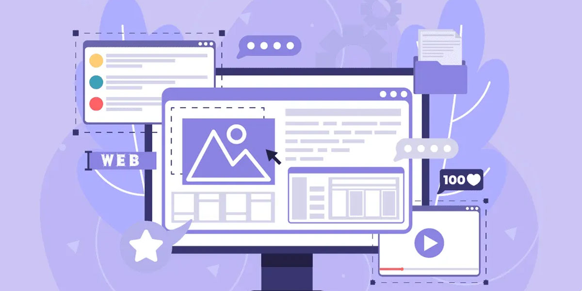
Top Web Design Trends for 2024
Implementing These Trends: A Practical Approach
Now that we’ve covered the top trends, here’s how you can start using them on your own websites:
Steps to Implement New Trends:
┌───────────────────────────────┐
│ 1. Start Small                │
│ 2. Test and Gather Feedback   │
│ 3. Keep Your Brand in Mind    │
│ 4. Focus on User Experience   │
│ 5. Stay Flexible              │
└───────────────────────────────┘
- Start Small: You don’t need to implement all these trends at once. Choose one or two that fit best with your brand and audience. For example, you might start by adding some micro-interactions to your existing design.
- Test and Gather Feedback: Before making major changes, test new design elements with a small group of users. Use analytics and user feedback to see how changes affect behaviour and engagement.
- Keep Your Brand in Mind: While trends are important, make sure any changes still align with your brand identity. Your website should still be recognizably “you”, even as you incorporate new design elements.
- Focus on User Experience: Always prioritise usability over flashy design. A beautiful website that’s hard to use won’t keep visitors coming back. Make sure new design elements enhance, rather than hinder, the user’s journey through your site.
- Stay Flexible: Web design trends can change quickly. Build your website in a way that makes it easy to update and adapt in the future. This might mean using a flexible CMS or building with modular components that can be easily swapped out.
Remember, not every trend will be right for every website. The key is to understand your audience and choose the trends that will best serve their needs and expectations.
Case Studies: Trends in Action
Let’s look at some examples of websites already using these 2024 trends effectively:
Example 1: AI-Powered E-commerce
An online clothing shop uses AI to:
- Show personalised product recommendations based on browsing history and previous purchases
- Offer a virtual try-on feature using AR, allowing customers to see how clothes would look on them
- Provide size recommendations based on previous purchases and customer measurements
The result? A more personalized shopping experience that has increased conversion rates by 25% and reduced returns by 40%.
Example 2: Immersive Portfolio
A photographer’s portfolio website uses:
- 3D image galleries that users can navigate through, creating an immersive viewing experience
- Subtle animations as users scroll through projects, bringing the images to life
- A dark mode toggle for viewing images in different lighting conditions, enhancing the viewing experience
This immersive approach has led to a 50% increase in time spent on the site and a 30% increase in client inquiries.
Example 3: Accessible News Site
A major news website improves accessibility by:
- Offering clear, adjustable text sizes to cater to users with different visual needs
- Providing audio versions of all articles, making content accessible to visually impaired users and those who prefer listening
- Ensuring all videos have accurate captions, benefiting deaf and hard-of-hearing users
These changes have not only made the site more inclusive but have also increased overall user engagement by 35%.
Case Studies: Trends in Action
Conclusion: Embracing the Future of Web Design
As we move through 2024, web design continues to evolve rapidly. The trends we’ve explored – from AI integration to sustainable design practices – are shaping a web that’s smarter, more accessible, and more engaging than ever before.
Remember, the key to successful web design isn’t just following trends, but understanding how these trends can benefit your specific users and business goals. By thoughtfully implementing these new ideas and technologies, you can create websites that not only look great but also provide meaningful, effective experiences for your users.
As you experiment with these trends, always keep your brand identity and user needs at the forefront. The most successful websites of 2024 will be those that balance innovation with usability, creating digital experiences that are both cutting-edge and intuitive.
FAQs
Which web design trend is most important for 2024?
While all the trends we’ve discussed are significant, the integration of AI and machine learning is perhaps the most transformative. It allows for highly personalised user experiences and can significantly improve website functionality.
How can I make my website more accessible?
Start by ensuring your website works well with screen readers can be navigated using only a keyboard, has good colour contrast, and uses clear, simple language. Regular testing with users who have different abilities can also help identify areas for improvement.
What are micro-interactions, and why are they important?
Micro-interactions are small, interactive elements on a website, like a button changing colour when you hover over it. They’re important because they provide feedback to users, make interfaces more intuitive, and can make using a website more enjoyable.
Should I choose a minimalist or maximalist design for my website?
The choice between minimalist and maximalist design depends on your brand identity and target audience. Minimalist designs work well for brands that want to appear sleek and professional, while maximalist designs can be great for creative or bold brands that want to make a strong visual impact.
How can I incorporate sustainable practices into my web design?
To make your website more sustainable, focus on optimising performance. This includes minimising file sizes, reducing the number of HTTP requests, and choosing a green hosting provider. Also, consider the energy efficiency of your design choices, such as avoiding autoplay videos or excessive animations.
By keeping these trends and best practices in mind, you’ll be well-equipped to create websites that are not only visually appealing but also functional, accessible, and future-proof. Happy designing!

With over two decades of web design and development expertise, I craft bespoke WordPress solutions at FallingBrick, delivering visually striking, high-performing websites optimised for user experience and SEO.


