Symmetry in design is the deliberate use of matching or repeated elements around a line, point or pattern. It can bring order and balance to a composition, but it is not a rule every design has to follow. This guide explains the main types of symmetry, how to use them in graphic and web design, and when an asymmetrical layout may work better.
Types of symmetry in design
The term covers several arrangements. These three are useful starting points for visual design:
- Reflective symmetry: elements on one side of an axis mirror those on the other. It is common in emblems, logos and balanced page compositions.
- Rotational symmetry: elements repeat around a central point, so the design looks similar after a turn. You will often see it in icons, badges and radial patterns.
- Translational symmetry: a motif repeats at regular intervals across a line or surface. It is useful for patterns, borders and tiled backgrounds.
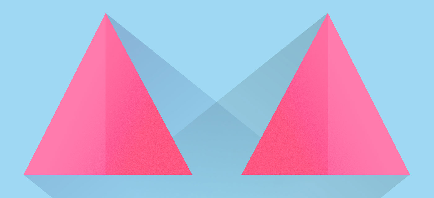
Examples of symmetry in a design composition
What symmetry can and cannot do
A symmetrical composition can make alignment and relationships between elements easier to see. It can also give a design a calm, formal or orderly feel. This can suit a logo, product, façade or layout where two areas need similar emphasis.
The effect depends on the content and context. Symmetry does not automatically make a design easier to use, more accessible or more trustworthy. A symmetrical page can still have weak contrast, unclear labels or poor hierarchy. If every element carries equal weight, the result may also feel static. Use symmetry to support the message, not as a substitute for clear structure.
How to use symmetry in your designs
Start with the purpose of the design and what you want people to notice. Then work through these steps:
1. Choose a focal point and an axis
Decide what should draw attention first. For reflective symmetry, mark the line that will organise the composition. For rotational symmetry, identify the centre point. A clear reference makes it easier to judge spacing and alignment.
2. Select the type of symmetry
Choose the arrangement that suits the content. Mirroring can work well for a badge or a two-part layout; rotation may suit an icon or pattern; repetition can create rhythm across a surface. You do not need to use every type in one design.
3. Balance visual weight, not just shape
Matching objects are not the only way to create balance. Colour, size, contrast, texture and empty space all affect how heavy an element feels. Two different elements can balance each other if their visual weight is considered.
4. Keep hierarchy clear
Do not mirror every item automatically. A heading, call to action or important control may need more emphasis than its counterpart. Use size, position and contrast to guide attention, even within a symmetrical composition.
5. Check the design at different sizes
A layout that works on a wide screen may become cramped on a phone. Let columns stack and content reflow when that improves reading; preserving symmetry is less important than keeping the page clear and usable.
Examples of symmetry in design
Symmetry appears in many disciplines, but the practical choices vary by medium:
Architecture and interiors
A centred entrance or a balanced façade can give a building a formal appearance. The site, function and circulation still matter; a symmetrical front does not require every room or feature inside to be mirrored.
Graphic and brand design
Reflective symmetry can help a badge, seal or icon feel cohesive. In a wordmark or poster, a small asymmetrical detail can add character and create a clearer focal point.
Product design
Controls or components may be arranged symmetrically when people use them in similar ways. Ergonomics and the intended user should come first, so a product should not be mirrored just for visual neatness.
Web and interface design
A balanced two-column layout or paired panels can make related information easy to compare. On narrower screens, the same content may need to stack or change order. See the guide to web design principles and the guide to landing page design for related layout advice.
Patterns and illustration
Repeated or rotated motifs can create rhythm across a surface. Varying colour, scale or spacing can keep a pattern from feeling mechanical while retaining its underlying structure.
Practical tips for using symmetry
Use a grid as a guide
A grid helps keep repeated elements aligned, but it does not mean every section needs to be a mirror image. Adjust the grid when the content calls for it.
Pay attention to negative space
The gaps around elements affect balance as much as the elements themselves. Check that spacing feels intentional on both sides of the axis.
Introduce contrast with purpose
A deliberate difference in colour, scale or position can lead the eye to the most important part of the design. Make the difference purposeful rather than random.
Test responsive layouts
Preview the design at desktop and mobile widths. If a mirrored arrangement becomes crowded, reflow it instead of forcing the original composition to fit.
Practical ways to use symmetry in a design
Conclusion
Symmetry is one way to organise a design, not a formula for making every composition work. Use mirroring, rotation or repetition when it helps people see relationships; introduce variation when it improves hierarchy or emphasis. For project examples, visit my web design portfolio.
FAQs
What is symmetry in design?
It is an arrangement in which visual elements correspond across an axis, repeat around a point or recur at regular intervals. The exact form depends on the design.
What are the main types of symmetry?
Common types include reflective symmetry, where elements mirror across an axis; rotational symmetry, where they repeat around a point; and translational symmetry, where a motif repeats across a surface.
How is symmetry used in graphic design?
Designers use it in logos, badges, packaging, posters and patterns to organise elements or create a balanced composition. It is an option, not a requirement.
Does symmetry always make a design look balanced?
No. Identical shapes can still feel uneven if their colour, contrast, size or surrounding space differs. Judge the overall visual weight, not just whether both sides match.
When should I use asymmetry instead?
Use an asymmetrical arrangement when it creates a clearer focal point, gives content a stronger hierarchy or better suits the message. A design can also combine symmetrical structure with a few deliberate variations.

With over two decades of web design and development expertise, I craft bespoke WordPress solutions at FallingBrick, delivering visually striking, high-performing websites optimised for user experience and SEO.