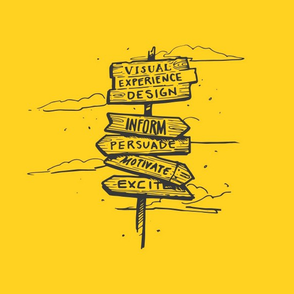
Good UX design helps people understand what a website or digital product offers and complete the task they came to do. It is not just a question of visual style. Research, content, navigation, accessibility, interactions and performance all shape the experience. This guide explains practical UX design principles and how to apply them, with links to more detailed guides on research, wireframing, testing and related topics.
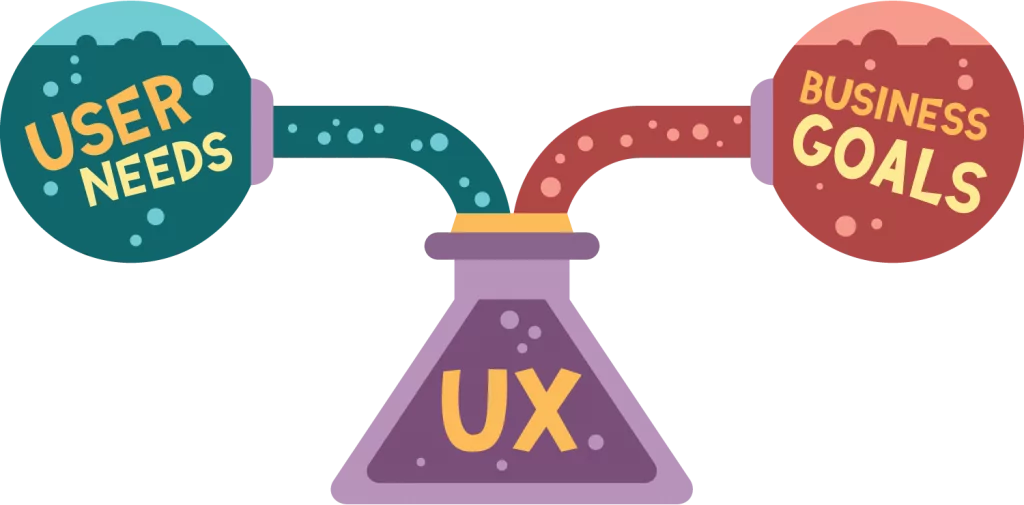
UX design starts with user needs
What UX design principles are
UX design principles are practical guides for making products easier to understand and use. They help teams make decisions about what information to show, how people move through a task and what feedback the interface should provide.
User experience covers the wider journey: what a person needs, what they expect, what happens when something goes wrong and whether they can complete their goal. User interface design is one part of that work. It covers the controls and visual elements people interact with, but good-looking screens alone do not guarantee a usable product.
Principles are not a substitute for research or testing. They help you form a design, then evidence from users shows whether it works for the people you intend to serve.
Begin with users and the task they need to complete
Before changing a layout, write down who the product is for and what those people are trying to do. A useful research question is specific, such as “Can first-time customers find delivery costs before checkout?” or “Can a new client understand which service to choose?”
Use more than one source of evidence. Analytics can show where people leave a journey, while interviews, support messages and usability sessions can help explain why. The GOV.UK Service Manual has practical guidance on planning user research, choosing methods and sharing findings: GOV.UK user research guidance.
Use personas as a summary, not as a substitute for evidence
A persona can help a team remember the needs of a user group, but it should be based on research rather than assumptions. Keep it focused on useful details such as the person’s goal, context, barriers and level of familiarity with the product. Update it when new evidence changes what the team understands.
Core UX design principles
These principles apply to websites, online shops and web applications. They work best when used together and checked against real user needs.
Make the next step clear
Use plain labels that describe what a link, button or form field does. Keep the main action easy to find, and avoid presenting several competing calls to action with equal weight. If a user needs to make a choice, explain the options before asking them to proceed.
Use consistent patterns
A navigation menu, button or form should behave in a predictable way wherever it appears. Consistency helps people transfer what they have learned from one part of a site to another. Reuse established patterns when they fit the task; do not change a familiar interaction only for visual novelty.
Organise information around user needs
Group related information and use labels people understand. Make important pages easy to find from the navigation and from relevant points in the user journey. A clear visual hierarchy helps people scan a page, but headings must describe the content that follows rather than simply decorate the layout.
Design for accessibility from the start
Make sure people can use key functions with a keyboard, see where focus is, read text at different sizes and understand form errors. Do not rely on colour alone to communicate status or meaning. Check colour contrast, labels, focus states and alternative text as part of design and testing.
The W3C’s WCAG 2.2 guidance includes testable accessibility criteria. For example, criterion 2.5.8 sets a minimum pointer target size of 24 by 24 CSS pixels, subject to defined exceptions. Treat accessibility as part of the design process, not a final polish. For public services, check the relevant UK requirements and current GOV.UK guidance as well.
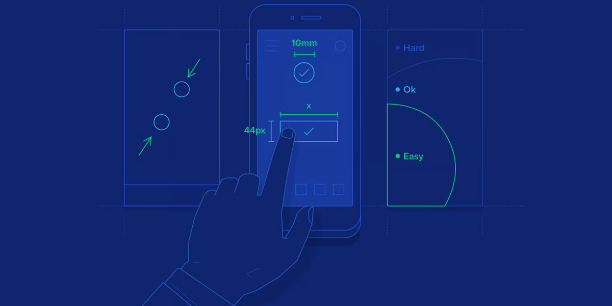
Clarity, consistency and accessibility are core UX principles
Turn ideas into designs you can test
A design process should expose problems while they are still inexpensive to fix. Start with a sketch or a simple wireframe before investing time in detailed visuals. A prototype can then show how a person moves between screens and responds to key decisions.
Sketch and wireframe the important journeys
Map the steps a user needs to take, including decision points and possible errors. A wireframe helps the team discuss structure and content without getting distracted by final colours or imagery. See our guides to UX sketching and the best wireframing tools for more detail.
Test tasks with users
Give participants a realistic goal and watch what they do. For example, ask someone to find a service’s price and explain what they would do next. Avoid leading them to the answer. Notice where they pause, what they misunderstand and whether they can recover from a mistake.
A usability test evaluates the design, not the participant. The GOV.UK guide to moderated usability testing explains how to set clear tasks and observe without coaching. You can also read our guide to usability testing.
Improve the design using what you learn
Record the problems that prevent people from completing a task, then prioritise them by impact and frequency. Make a change, test the journey again and keep a note of what improved. A single comment is a useful clue, but look for patterns before treating it as a general rule.

Sketching, prototyping and testing help validate design decisions
Make mobile interactions work in context
A mobile-first approach can help teams prioritise essential information and actions before adapting a design for larger screens. It does not mean every mobile interface should be reduced to the smallest possible layout. Check how content, navigation, forms and key tasks work at different screen sizes.
Make controls easy to identify and operate. Do not rely on a swipe or other gesture when a visible control can provide an alternative. Keep forms manageable on smaller screens and make sure the on-screen keyboard does not hide the field or action a person needs next. Our guide to mobile-first design covers the approach in more detail.

Check mobile journeys as well as desktop layouts
Use visual design to support understanding
Typography, spacing and colour help people see what matters and understand how content is organised. Choose readable type sizes and line spacing. Use colour consistently, and pair it with text, icons or other cues when the meaning matters. Our article on colour theory in web design explains how to build a considered palette.
Use images and icons when they clarify the content or help a user make a decision. An icon that is unfamiliar should have a text label. Motion can provide useful feedback, but decorative animation should not distract from the task or make the interface harder to use. See our guide to microinteractions in web design for examples.
Make forms, dialogs and errors easier to recover from
Forms should ask only for information needed at that point in the journey. Use a visible label for each field, explain any unusual requirement and keep a person’s entries if validation fails. An error message should identify the field and say how to correct the problem; do not rely on a red outline alone.
A dialog should make its purpose clear, keep keyboard focus in the right place while it is open and provide an obvious way to close it. Do not use a modal for information that could be shown inline without interrupting the task. See our guide to modals in web design for more examples.
Apply UX principles to shops and web applications
In an online shop, help customers find products, compare relevant details and see delivery costs before they commit to an order. Keep checkout steps clear and explain what happens after each action. If a payment or form error occurs, tell the customer what went wrong and how to continue without making them repeat information unnecessarily.
For a web application, prioritise the information people need to make a decision. Dashboards should not give every metric equal prominence. Group related actions, use clear labels and provide a useful empty state when there is no data yet. For more on checkout friction, see our guide to recovering abandoned baskets.
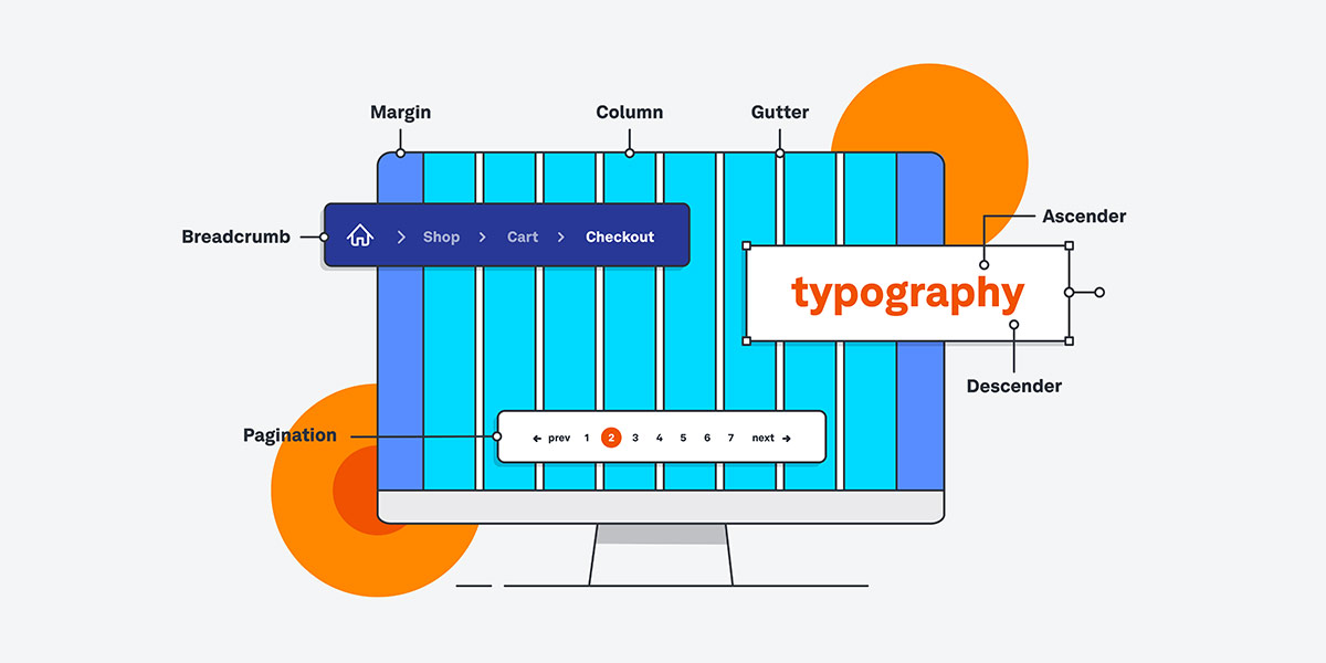
UX principles apply to forms, dashboards and online shops
Measure whether the experience is working
Choose measures that reflect the task. Depending on the product, these might include task completion, errors, time to complete a task, successful enquiries, checkout completion or support requests. Pair analytics with user research: numbers can show where a journey changes, while observation can help explain what people find difficult.
Performance also affects how a page feels to use. Google’s Core Web Vitals measure loading performance, responsiveness and visual stability. They are useful indicators, but they do not describe the whole user experience or guarantee search rankings.
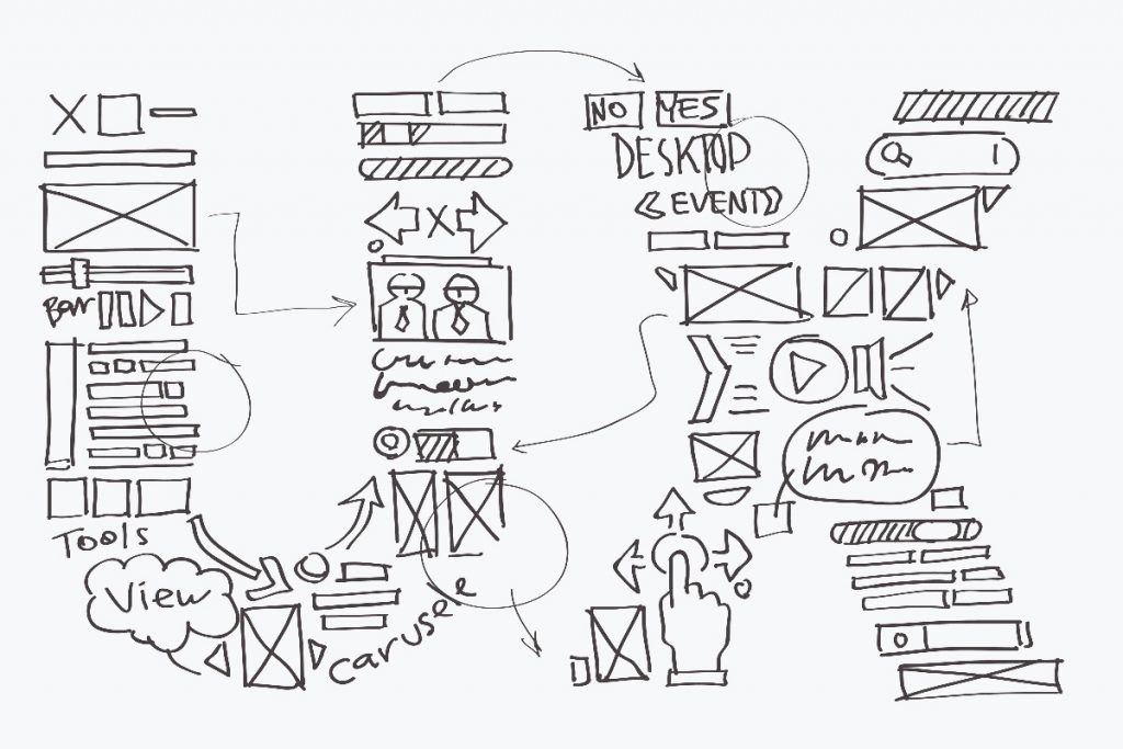
Review designs with users and improve them over time
A practical UX design checklist
- Define the user group and the task the design should support.
- Use research and existing evidence to understand needs and barriers.
- Make the content, labels and next steps clear.
- Check accessibility, keyboard use, focus, contrast and error handling.
- Sketch the journey, build a prototype and test it with representative users.
- Measure task outcomes, fix the biggest problems and test again.
Related UX design guides
Use these guides to explore specific parts of the process:
- UX laws designers often misunderstand for principles that can inform design decisions.
- UX sketching and wireframing tools for early-stage concepts and user flows.
- Usability testing for evaluating whether people can complete key tasks.
- User interface design principles for the visual and interactive layer of a digital product.
- UX and SEO for the relationship between user experience and search visibility.
FAQs
What are the main UX design principles?
Start with user needs, make tasks clear, use consistent patterns, organise information well, design accessibly and test the result with users. The right priorities depend on the people and task involved.
What is the difference between UX and UI design?
UX design considers the wider experience of using a product, including research, content, navigation and task completion. UI design focuses on the interface people interact with, including its controls and visual presentation. UI is part of UX, but the terms do not mean the same thing.
How can I improve UX on an existing website?
Choose an important task, such as finding a service or sending an enquiry. Review the journey, watch real users try it and note where they hesitate or make mistakes. Fix the most significant barriers, then test the change.
Does UX design improve SEO?
UX improvements can make a site easier to use, but they do not guarantee higher rankings. Google describes Core Web Vitals as measures of loading, responsiveness and visual stability; they are only part of the wider page experience and search systems.
How often should I test a website’s UX?
Test whenever you make a meaningful change to an important user journey, and revisit the experience as user needs, content or technology change. Small, focused tests can reveal issues before they affect a larger share of visitors.

With over two decades of web design and development expertise, I craft bespoke WordPress solutions at FallingBrick, delivering visually striking, high-performing websites optimised for user experience and SEO.