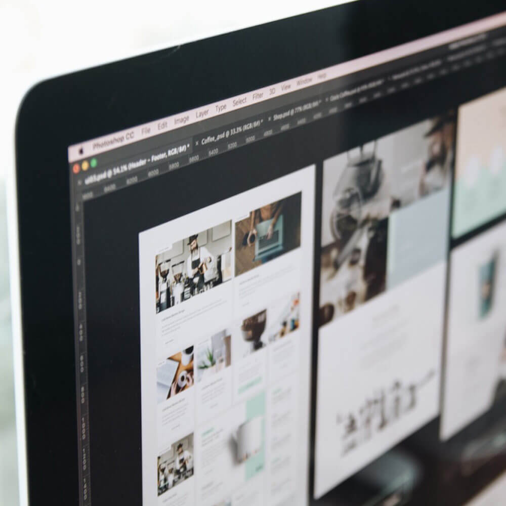
If you’ve just finished web design project it’s worth to spend a while to check is everything ok. Here is the list of things to check, just to avoid most common mistakes committed by web designers in Photoshop.
Don’t use common fonts
It’s obvious Arial is a great font in web design but today you have so many different options to choose from – like Adobe Typekit or Google Webfonts etc. They offer a huge number of great fonts. Remember typography is extremely important! Most of the fonts they offer are free, lightweight and you can easily implement them by adding just a few lines of code. So why not use some new and fresh fonts in your design?
BTW. Don’t use many different fonts in one design.
Try to tidy up your design (use folders)
Try to remember about this simple but fundamental rule. Just think about the developer who needs to find some elements in your design in a simple and fast way. If you’ll not use folders to organize graphical elements in groups, everyone finds your design as really painful and messy (including you after some time). Try to spread the elements in some logical sections (folders), like header, main body, footer etc.
BTW. Try to use coloured folders for hover states, drop-down menus etc. This will be very useful for your developer.
Use anti-aliasing for text (to avoid designs with jagged pixels)
Anti-aliasing used for text gives your pixels crisp and smooth effect. If you’ll forget about this simple thing, your design will look like made in 90’s because of jagged pixels. To use this effect just access to the top bar and choose one of the following options: sharp, crisp, strong, smooth. I think “sharp” is the best option here.
BTW. Make sure all your fonts in your design use the same effect. So if you’re using “sharp” in one place, use this for all – don’t mix it!
The most common mistake in web design. Usually, commit because of the time pressure (and it wasn’t requested by the customer). It’s really worth to spend a moment and implement these things into your design (PSD file). After that, your design will look much more professional.
Give a space to breath (use some whitespace)
Photoshop is a great software in web design, gives you full control on your design, like for instance how much whitespace you’ll keep between some elements. It’s nice to use some grid here – remember about consistency (the same number of pixels between). It’s 100% sure your design will look much better after all.
Try to reduce the file size by rasterizing all smart objects
Everyone loves smart objects, they are a great thing but unfortunately consumes quite a lot of space. You shouldn’t be surprised if your web design (PSD) file will have few hundred mb because of overloading by smart objects. They are really useful in the design stage, but after all, in most cases, clients don’t need them. By rasterizing smart objects you can reduce your final file size by up to 90%.
Resume
If you keep in mind these things, your final design will look great. The good thing is to adopt above points are not really hard, try to use them as a habit and you’ll achieve the wonderful final effect.

With over two decades of web design and development expertise, I craft bespoke WordPress solutions at FallingBrick, delivering visually striking, high-performing websites optimised for user experience and SEO.


