
Modals in Web Design
Modals have become essential tools in modern web design. These overlay windows appear on top of the main content, demanding attention without forcing users to a new page. However, using modals effectively requires skill and understanding. Poor implementation can drive visitors away, while thoughtful design can create a smooth, engaging experience that keeps users coming back.
This guide explores modals in depth. We’ll cover what they are, when to use them, and how to make them work effectively. Whether you’re an experienced designer or just starting out, you’ll find valuable tips and techniques to improve your use of modals.

Modals in Web Design
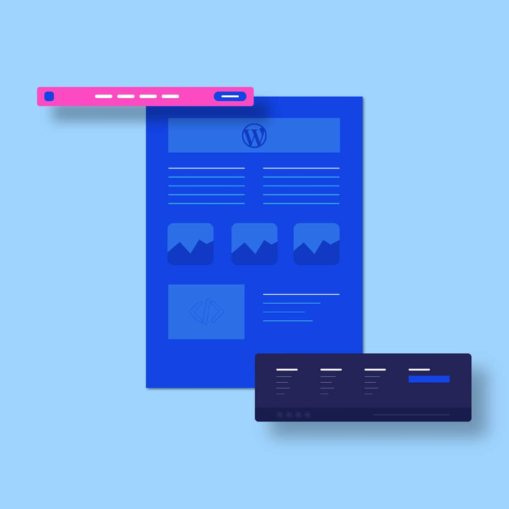
What Are Modals?
Modals are overlay windows that appear on top of the main webpage content. They require user interaction before allowing return to the main content. Think of them as a focused interruption, asking for your attention momentarily.
Modals serve several purposes:
- Displaying important messages
- Collecting user information
- Guiding decision-making processes
- Showcasing media content
While powerful, modals must be used judiciously. Overuse or poor implementation can lead to user frustration rather than engagement.
When Should You Use Modals?
Modals are powerful tools, but they’re not always the right choice. Here’s a quick breakdown of when to use modals and some alternatives to consider:
| Use Case | Modal Suitable? | Alternative |
|---|---|---|
| Important announcements | Yes | Notification banner |
| Error messages | Yes | Inline validation |
| Image galleries | Yes | Lightbox |
| Long forms | No | Multi-step form |
| Navigation | No | Mega menu |
| Tooltips | No | Hover tooltips |
Let’s dive deeper into some situations where modals can really shine:
1. Sharing Important News
Got a big update or a special offer? A modal can be a great way to spread the word. Just make sure it’s easy for people to close if they’re not interested.
2. Gathering Information
Need an email address for your newsletter? Want feedback on your new product? Modals can help you collect this information without cluttering up your main page.
3. Guiding Decisions
If you need someone to confirm an action or choose between options, a modal can help focus their attention and guide them through the process.
4. Showcasing Media
Want to display a larger version of an image or play a video? Modals can create a distraction-free environment for viewing media.
Making Modals Work for You: Best Practices
Now that we know when to use modals, let’s talk about how to use them effectively. Here are some top tips to keep in mind:
- Use Modals Sparingly: Modals are like spices in cooking. A little can add flavour, but too much can ruin the dish. Use them only when necessary, and your visitors will thank you.
- Make Them Look Good on All Devices: Your modal should look great whether someone’s using a massive desktop monitor or a tiny mobile screen. Test your modals on different devices to make sure they’re always easy to read and use.
- Give People an Easy Way Out: Always provide a clear way to close the modal. This could be a visible ‘X’ button, the ability to click outside the modal, or using the ‘Esc’ key. Don’t make people feel trapped.
- Keep It Clear and Simple: Your modal should have a clear purpose. Use plain language and straightforward instructions. If people don’t understand what you want, they’re likely to just close the modal and move on.
- Use Descriptive Button Text: Instead of vague terms like ‘OK’ or ‘Cancel’, use specific phrases that describe the action. ‘Save Changes’ or ‘Discard Edits’ tell people exactly what will happen when they click.
Pro TipUse action-oriented language in your modal buttons. For example, instead of “Yes” and “No”, try “Confirm Purchase” and “Keep Shopping”.
- Avoid Nested Modals: Modals within modals can be confusing. If you need to show more information, consider using a different method, like an expandable sidebar.
- Make Them Accessible to Everyone: Not everyone uses a mouse or can see the screen clearly. Make sure your modals work with keyboard navigation and screen readers. This isn’t just good practice – it’s the right thing to do.
- Don’t Be a Pest: If someone closes your modal, respect that decision. Don’t keep showing the same modal over and over. And if it’s not critical information, consider using a less intrusive method to display it.
- Make Them Look Good: Your modals should fit in with the rest of your website’s design. Use consistent colours, fonts, and styles. A well-designed modal can enhance the user experience, while a poorly designed one can be jarring.
- Keep Testing and Improving: The only way to know if your modals are working well is to test them. Watch how people interact with them and be ready to make changes based on what you learn.
Digging Deeper: Modal Design Techniques
Now that we’ve covered the basics, let’s explore some more advanced techniques for creating effective modals.
The Art of Timing
When your modal appears can be just as important as what it contains. Here’s a comparison of different timing strategies:
| Timing Strategy | Description | Best For |
|---|---|---|
| Immediate Display | Show as soon as the page loads | Critical messages, time-sensitive offers |
| Delayed Display | Wait a few seconds before showing | Engagement prompts, special offers |
| Scroll-Triggered | Display when the user scrolls to a certain point | Newsletter sign-ups, related content suggestions |
| Exit-Intent | Show when the user is about to leave the page | Last-minute offers, feedback requests |
Creating Engaging Content
The content of your modal can make or break its effectiveness. Here are some tips for creating engaging modal content:
- Keep it Concise: Get to the point quickly. Users should be able to understand the purpose of the modal at a glance.
- Use Visuals: A well-chosen image or icon can help convey your message more effectively than text alone.
- Personalise When Possible: If you have data about your users, use it to make the modal more relevant to them.
- Create a Sense of Urgency: For promotional modals, consider using countdown timers or limited-time offers to encourage action.
Content Checklist:
Clear headline
Concise body text
Relevant image or icon
Clear call-to-action
Easy way to dismiss
Design Elements That Make a Difference
The visual design of your modal can significantly impact its effectiveness. Here are some design elements to consider:
- Contrast: Make sure your modal stands out from the background. This doesn’t mean it should clash, but it should be clearly visible.
- White Space: Don’t cram your modal full of content. Use white space to make it easier to read and less overwhelming.
- Typography: Choose fonts that are easy to read. Consider using larger text for key information.
- Colour Psychology: Use colours thoughtfully. For example, red might create a sense of urgency, while blue can be calming.
- Animations: Subtle animations when the modal appears or disappears can make the experience feel more polished.
Here’s a quick guide to colour psychology in modal design:
| Colour | Emotion | Best For |
|---|---|---|
| Blue | Trust, Calm | Login forms, security messages |
| Green | Growth, Success | Confirmation messages, eco-friendly initiatives |
| Red | Urgency, Importance | Error messages, limited-time offers |
| Yellow | Optimism, Clarity | Warnings, new feature announcements |
| Purple | Luxury, Creativity | Premium offers, artistic content |
Technical Considerations
From a technical standpoint, there are several things to keep in mind when implementing modals:
- Performance: Modals should load quickly and not slow down your site. Optimise any images or scripts used in your modals.
- Mobile Responsiveness: Ensure your modals work well on touch screens. Buttons should be large enough to tap easily.
- Browser Compatibility: Test your modals across different browsers to ensure consistent behaviour.
- Keyboard Navigation: Make sure users can navigate through the modal using their keyboard.
- Screen Reader Support: Use appropriate ARIA labels and roles to make your modals accessible to screen readers.
Accessibility Checklist:
- Keyboard navigable
- Screen reader friendly
- High colour contrast
- Large enough touch targets
- Clear focus indicators
Common Modal Mistakes to Avoid
Even with the best intentions, it’s easy to make mistakes when using modals. Here are some common pitfalls to watch out for:
- Overuse: Showing too many modals can quickly become annoying. Use them sparingly and only when necessary.
- Poor Timing: Displaying a modal too soon or too late can disrupt the user experience. Consider the user’s journey and when a modal would be most relevant.
- Difficult to Close: Always provide a clear and easy way to dismiss the modal. A hidden or tiny close button can frustrate users.
- Too Much Content: Modals should be focused. If you find yourself trying to cram too much into a modal, consider whether it’s the right format for that content.
- Ignoring Mobile Users: Modals that work well on desktops might be problematic on mobile. Always test on various devices.
- Forgetting About Accessibility: Make sure your modals are usable by everyone, including those using assistive technologies.
- Inconsistent Design: Your modals should feel like a natural part of your site, not something tacked on as an afterthought.
The Future of Modals in Web Design
As web design continues to evolve, so too will the use of modals. Here’s a glimpse into the future of modal design:
| Trend | Description | Potential Impact |
|---|---|---|
| AI-Powered Personalisation | Modals that adapt content based on user behaviour | More relevant and engaging user experiences |
| Voice-Activated Modals | Modals controlled by voice commands | Improved accessibility and hands-free interaction |
| Augmented Reality Integration | Modals extending beyond the screen using AR | Immersive and interactive experiences |
| Improved Accessibility | More sophisticated tools for modal accessibility | Inclusive design that works for all users |
| Context-Aware Modals | Modals appearing based on user context (location, time, etc.) | Highly relevant and timely information delivery |
Wrapping Up
Modals are a powerful tool in the web designer’s toolkit. When used wisely, they can enhance the user experience, guide users through complex processes, and boost engagement. But like any powerful tool, they need to be used with care and consideration.
Remember, the key to successful modal design is to always put the user first. Ask yourself: Is this modal helping or hindering the user? Is it providing value, or is it just getting in the way? By keeping these questions in mind and following the best practices we’ve discussed, you’ll be well on your way to creating modals that truly enhance your website.
So go forth and design with confidence. Your modals await!
Ready to level up your modal game? Here’s a quick checklist to get you started:
- Define the purpose of your modal
- Choose the right timing for display
- Create clear and concise content
- Design for all devices
- Ensure accessibility
- Test thoroughly
- Gather user feedback
- Iterate and improve
Happy designing!

With over two decades of web design and development expertise, I craft bespoke WordPress solutions at FallingBrick, delivering visually striking, high-performing websites optimised for user experience and SEO.