
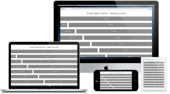
In this article, you can find a list of CSS Frameworks for Responsive Web Design (RWD). They will help you in the development of a great website of any size (desktop, tablet and mobile). Responsive web design (RWD) is a great solution in web design today – one design fits all devices. It’s possible because of the fluid grid system (called the framework). Building a responsive website from scratch can be painful for web designers, but if we use responsive HTML5 and CSS3 frameworks we can get an easy and quick solution for web designers. I strongly recommend using one of the frameworks listed below (to save a lot of time and simplify the development process). All of these frameworks, and boilerplates include the most time-consuming elements like – media queries, grids and ready-to-use layouts to use in your design. Here is the list of the most popular Frameworks for Responsive Web Design for web designers.
Bootstrap

Frameless Grid

Gumby Framework

Gridless

The Semantic Grid

1140 CSS Grid

Proportional Grids

Simple Grid

320 and Up

Foundation 3

Less Framework 4

Amazium

IVORY Framework
Responsive Grid System

Golden Grid System

Ingrid Framework

The Goldilocks Approach

Less+ Framework

Stack Layout

Initializr

Columnal

Yet Another Mobile Boilerplate

Skeleton

Fluid Baseline Grid

Responsive Grids for Compass


With over two decades of web design and development expertise, I craft bespoke WordPress solutions at FallingBrick, delivering visually striking, high-performing websites optimised for user experience and SEO.