
Have you ever visited a website and found yourself frustrated, struggling to find the information or page you were looking for? The chances are that poor website navigation was the culprit. A well-designed navigation menu is the backbone of any website, enabling users to effortlessly explore and interact with its content. In this article, we will delve into the world of website navigation menus, exploring their importance, best practices, SEO optimization, and future trends.
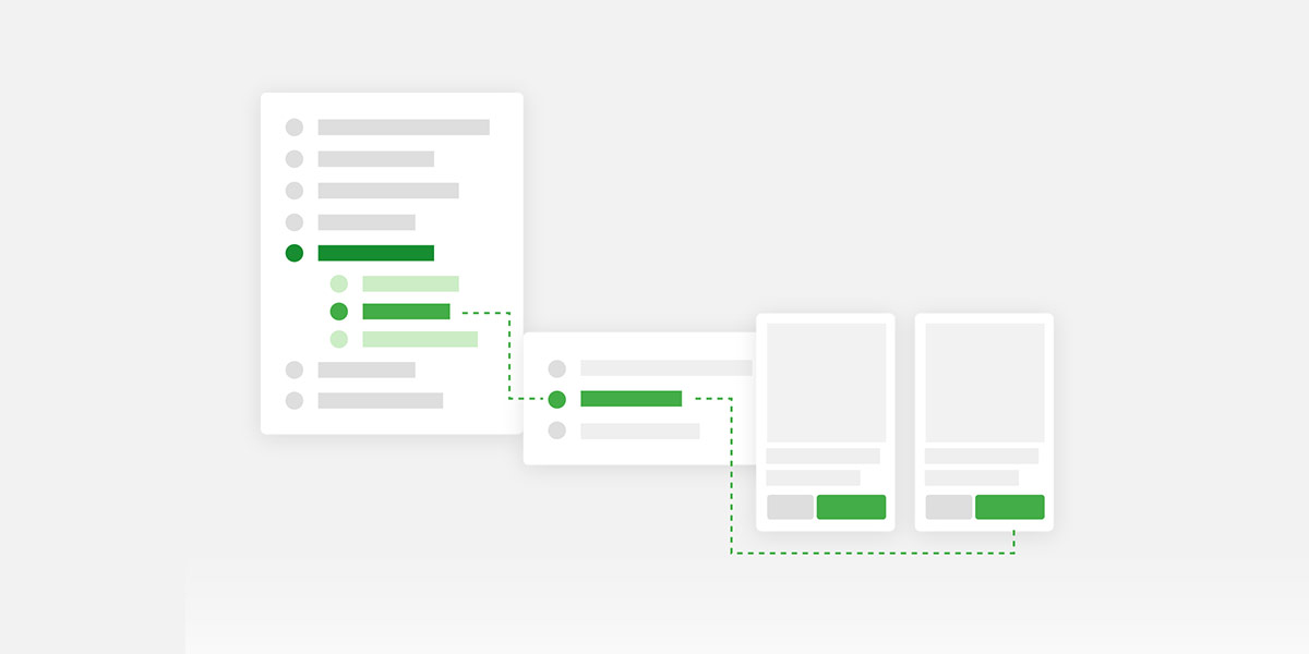
The Importance of Well Designed Website Navigation Menu
The navigation menu serves as a roadmap for users, allowing them to navigate through different sections of a website and find relevant content. It plays a crucial role in enhancing the user experience, reducing bounce rates, and increasing conversions. A poorly designed or confusing navigation menu can drive users away, resulting in lost opportunities and a negative perception of your brand.
To create an effective website navigation menu, it’s essential to consider some key principles:
Hierarchy and Organization
A well-structured hierarchy ensures that users can easily locate desired information. By categorizing content and prioritizing important sections, you guide users through their journey on your website.
Clear Labels and Descriptions
Using concise and descriptive labels for menu items helps users quickly understand what they can expect to find. Avoid jargon or ambiguous terms that may confuse your audience.
Consistency and Familiarity
Maintaining consistency across your website’s navigation menus ensures a familiar user experience. Users should be able to anticipate where to find specific information regardless of the page they are on.
Responsive and Mobile-Friendly Design
With the increasing use of mobile devices, responsive design is vital. Ensure your navigation menu adapts seamlessly to different screen sizes, allowing users to navigate effortlessly on smartphones and tablets.
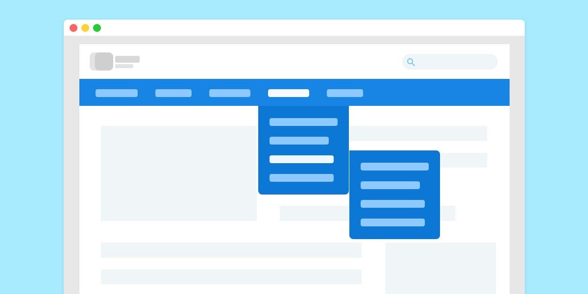
Well-Designed Website Navigation Menu: Key Principles for Effective Website Navigation
There are various types of navigation menus, each with its strengths and use cases. Let’s explore some common options:
Horizontal Menus
Horizontal menus are typically placed at the top of a website and are ideal for websites with limited menu items. They provide a compact and straightforward navigation experience.
Vertical Menus
Vertical menus, also known as sidebar menus, are commonly positioned on the left or right side of a website. They are beneficial when dealing with a large number of menu items or hierarchical navigation structures.
Mega Menus
Mega menus are expansive dropdown menus that display multiple levels of navigation options. They are useful for websites with a vast amount of content or complex navigation needs.
Hamburger Menus
Hamburger menus are commonly seen on mobile devices and have become prevalent in responsive web design. They feature a simple icon that expands into a full menu when clicked or tapped.

Well-Designed Website Navigation Menu: Different Types of Navigation Menus
To create a user-friendly and intuitive navigation menu, consider the following best practices:
Strategic Placement and Visibility
Place the navigation menu in a prominent location where users expect to find it. Ensure it remains visible even when scrolling, providing easy access to essential sections.
Limited Menu Items
Overloading your navigation menu with numerous options can overwhelm users. Keep the number of menu items to a minimum, prioritizing the most critical sections.
Dropdown and Flyout Menus
Dropdown menus allow you to present additional navigation options when users hover or click on a menu item. Flyout menus extend this concept, providing more extensive content previews.
Search Functionality
Including a search bar within the navigation menu enables users to quickly find specific content, bypassing the need for extensive browsing.
Breadcrumb navigation displays the user’s current location within the website’s hierarchy. It helps users understand their position and provides an easy way to navigate back.
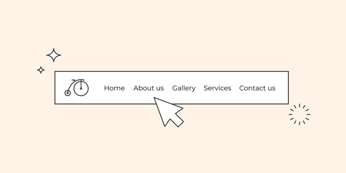
Well-Designed Website Navigation Menu: Best Practices for Designing Website Navigation Menus
Having a well-optimized navigation menu can positively impact your website’s visibility in search engine results. Consider the following SEO practices:
Using Descriptive Keywords
Incorporate relevant keywords in your menu labels and descriptions to signal search engines about the content and purpose of each page.
Structured Data Markup
Utilize structured data markup, such as schema.org, to provide search engines with additional information about your navigation menu’s structure and organization.
XML Sitemaps
Including your navigation menu in the XML sitemap helps search engines understand the relationships between your website’s pages and navigate them more effectively.
Apart from functionality, your navigation menu should focus on enhancing the overall user experience. Consider the following aspects:
Design your navigation menu to guide users logically through the website, providing a seamless flow of information and reducing friction.
Visual Cues and Feedback
Use visual cues such as highlighting or changing the colour of active menu items to indicate the user’s current location. Provide feedback when users interact with menu options.
Call-to-Action Buttons
Strategically place call-to-action buttons within your navigation menu to encourage users to take desired actions, such as signing up or making a purchase.
Personalization and User Preferences
Leverage user data and preferences to personalize the navigation experience. Offer options for users to customize the menu according to their preferences or browsing habits.
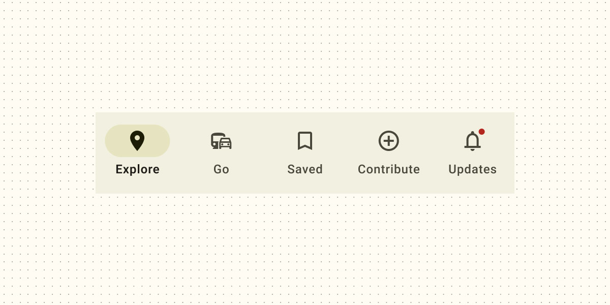
Well-Designed Website Navigation Menu: Enhancing User Experience with Navigation
As mobile usage continues to rise, designing a mobile-friendly navigation experience is crucial. Consider the following mobile navigation design practices:
Responsive Design
Ensure your navigation menu adapts to different screen sizes and orientations, providing an optimal experience across various devices.
Touch-Friendly Elements
Optimize your navigation menu for touch interactions, ensuring buttons and menu items are large enough and spaced appropriately for easy tapping.
Off-Canvas Menus
Off-canvas menus hide the navigation menu off-screen and slide it into view when triggered. This design approach saves valuable screen space while providing full access to the menu when needed.
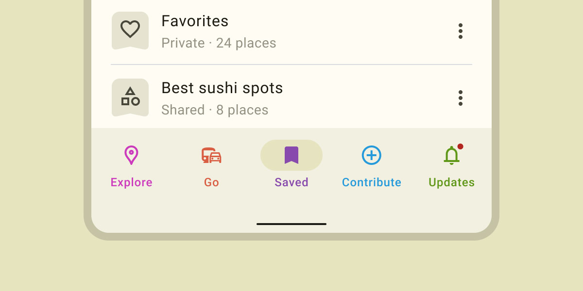
Well-Designed Website Navigation Menu: Mobile Navigation Design
Designing an accessible navigation menu ensures that all users, regardless of disabilities, can navigate your website. Consider the following accessibility considerations:
Ensure your navigation menu is fully accessible via keyboard navigation, allowing users who rely on assistive technologies to navigate through the menu options.
ARIA Labels and Roles
Use ARIA (Accessible Rich Internet Applications) labels and roles to provide additional information and context to screen readers, helping visually impaired users understand your menu’s purpose.
Colour Contrast and Visual Impairments
Ensure sufficient colour contrast between menu elements and the background to accommodate users with visual impairments or colour blindness.
To continuously improve your website’s navigation, use various measurement and analysis techniques:
User Testing and Feedback
Conduct user testing sessions to gather feedback and insights on the usability of your navigation menu. This can help identify pain points and areas for improvement.
Heatmaps and Click Maps
Utilize heatmaps and click maps to analyze user behaviour and interactions with your navigation menu. This data can provide valuable insights into user preferences and areas of interest.
Analytics Tools
Leverage analytics tools like Google Analytics to monitor user flow, bounce rates, and conversion rates related to your navigation menu. Identify areas of improvement based on data-driven insights.

Well-Designed Website Navigation Menu: Measuring and Analyzing Navigation Performance
The field of website navigation is constantly evolving. Consider the following future trends:
As voice assistants become more prevalent, voice-activated navigation will gain prominence. Websites will need to adapt to voice commands to provide seamless navigation experiences.
Augmented Reality Interfaces
Augmented reality (AR) has the potential to revolutionize website navigation. AR overlays can guide users through physical spaces, providing real-time directions and information.
Contextual and Adaptive Menus
Advancements in machine learning and AI will enable navigation menus to adapt dynamically based on user preferences, behaviour, and contextual information, delivering personalized experiences.

Well-Designed Website Navigation Menu: Future Trends in Website Navigation
Conclusion
A well-designed website navigation menu is essential for providing a seamless user experience. By following the key principles, and best practices, and considering SEO optimization, accessibility, and future trends, you can create a navigation menu that engages users, enhances their journey on your website, and drives conversions. Remember, the key to success lies in understanding your users’ needs and designing a navigation experience that aligns with their expectations.
FAQs
It’s recommended to keep the number of menu items limited to ensure a clean and uncluttered navigation experience. Focus on the most important sections and prioritize user-friendly categorization.
SEO optimization helps search engines understand the structure and content of your website. By incorporating relevant keywords and utilizing structured data markup, you can enhance your website’s visibility in search results.
Both desktop and mobile navigation designs are equally important. With the increasing use of mobile devices, ensure your navigation menu is responsive and provides a seamless experience across all screen sizes.
Consider keyboard navigation, ARIA labels and roles, and colour contrast when designing an accessible navigation menu. This ensures users with disabilities can navigate your website effectively.
Google Analytics, Hotjar, and Crazy Egg are popular analytics tools that can provide valuable insights into user behaviour, click patterns, and navigation performance.

With over two decades of web design and development expertise, I craft bespoke WordPress solutions at FallingBrick, delivering visually striking, high-performing websites optimised for user experience and SEO.


